


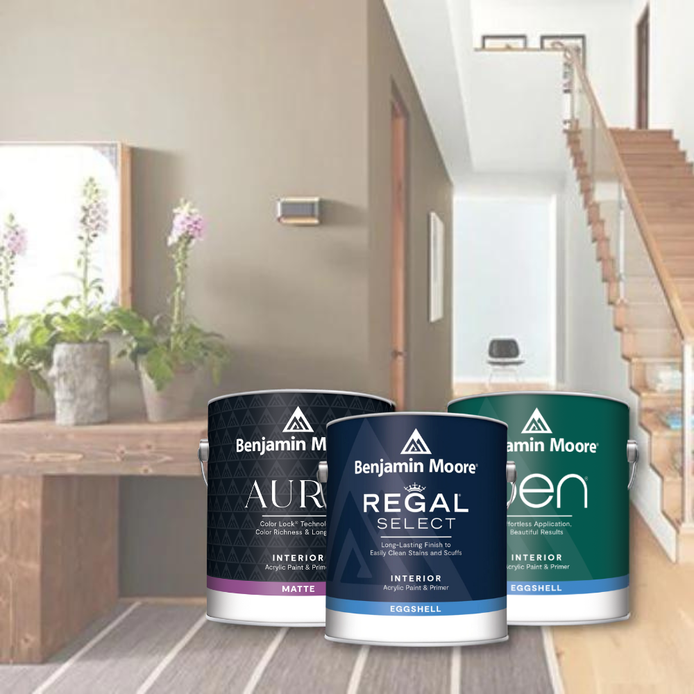


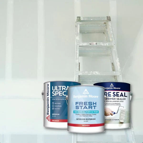













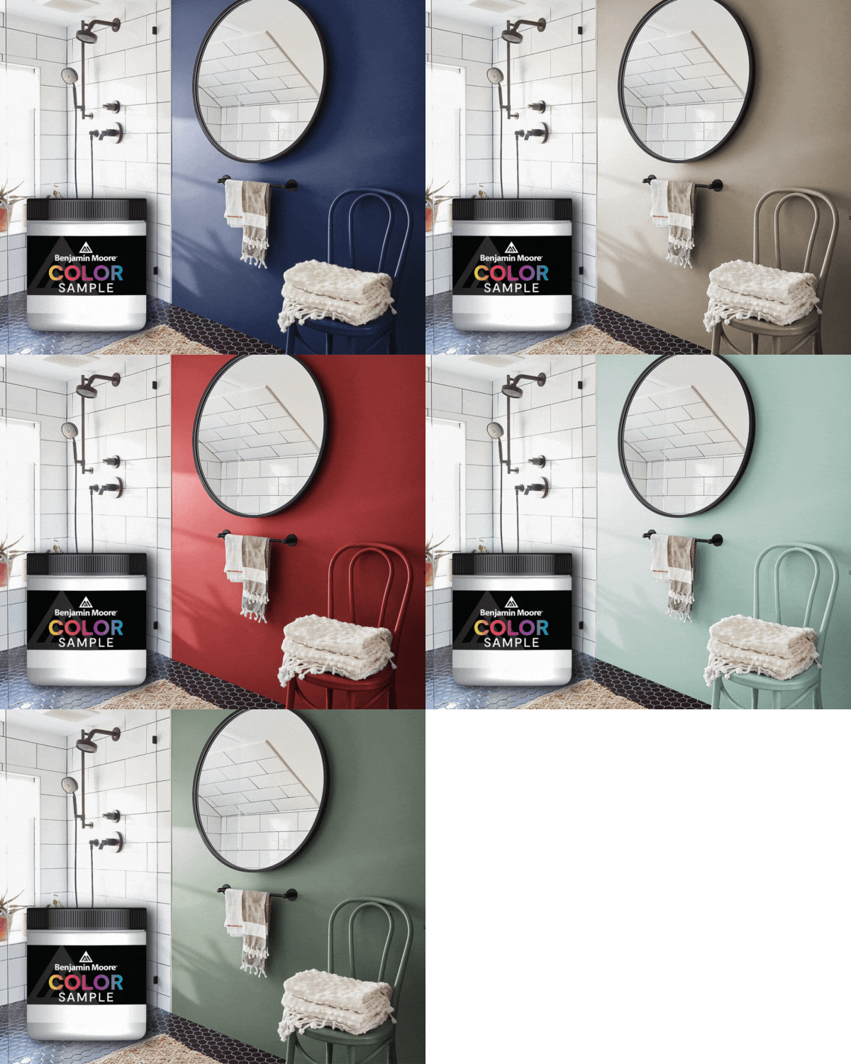


October in the Midwest brings shorter days, richer light, and a craving for spaces that feel warm, layered, and intentional. This month, JC Licht is spotlighting a color that captures all of that autumn energy in a single brushstroke: Benjamin Moore Navy Masterpiece 1652. Read on to discover how this bold blackened teal can transform your home - and how to pair it for a sophisticated fall palette.
Key Takeaways
-
Benjamin Moore Navy Masterpiece 1652 is JC Licht's October Color of the Month - a blackened teal navy with an old-world, painterly depth that suits both traditional and modern interiors.
-
Navy Masterpiece works beautifully on walls, cabinetry, doors, and even as ceiling paint when coordinated with proper finishes and lighting, making it far more versatile than a typical dark color.
-
Pair it with warm neutral Royal Flax CSP-316 and rich brown Autumn Bronze 2162-10 for a complete, seasonally grounded Benjamin Moore palette.
-
Navy Masterpiece shines in entryways, dining rooms, home offices, bedrooms, and accent walls - anywhere you want drama tempered by sophistication.
-
Visit your local JC Licht store for expert color advice, peel-and-stick samples, and ceiling paint specifically formulated for a flawless overhead finish.

Meet Benjamin Moore Navy Masterpiece 1652
As the leaves turn and Chicago's skyline glows amber at dusk, there is no better time to bring a deep, contemplative color into your home. Navy Masterpiece is JC Licht's October Color of the Month - a hue that channels the blackened teal depth of an old-masters painting, moody and magnetic in equal measure.
Navy Masterpiece is color code 1652 by Benjamin Moore and belongs to theBenjamin Moore Classics® collection, a lineup known for timeless appeal and versatility across decades of design trends. Whether you live in a century-old Chicago bungalow, a Lincoln Park greystone, or a modern North Shore new-build, this classic works in ways that feel both grounded and surprising.
So what does Navy Masterpiece actually look like? In concrete terms, it is a bold, blackened teal with green and black undertones - nothing like a primary blue or a nautical stripe. Its LRV sits around 9, meaning it absorbs nearly all the light that hits it, creating rich, saturated surfaces that feel velvety and enveloping.
That subtle teal undertone is what gives Navy Masterpiece its painterly, almost iridescent quality - a sense that the color shifts and breathes with the light in the room. In cool, north-facing daylight, the blue-green side emerges. Under warm incandescent bulbs or in evening light, the hue deepens into an inky, saturated pool. Navy Masterpiece can appear more teal in bright lighting, which keeps it from ever feeling flat or one-note.
How does it compare to other popular deep blues from Benjamin Moore? If you know Hale Navy (HC-154), think of Navy Masterpiece as its moodier, more blackened sibling. Where Hale Navy reads as a crisp, classic navy, Navy Masterpiece dips into teal territory and absorbs more light, making it ideal for intimate, cocooning spaces.
A few practical notes:
-
Collection: Benjamin Moore Classics®
-
LRV: ~9.14 (very low, very dramatic)
-
Undertone: Cool blue-green / teal, with blackened depth
-
Pricing: Positioned as a premium paint color; pricing varies by finish and product line - check your local JC Licht for current rates
-
This color is suitable for both traditional and modern styles, from paneled studies to minimalist galleries
Ready to see how this hue transforms real rooms? Let's walk through where and how to use Navy Masterpiece this October.

How to Use Navy Masterpiece in Your Home
Navy Masterpiece is more flexible than most people expect from a color this deep. It works beautifully on everything from full-room walls to small accents, and it suits Chicago condos, suburban family homes, and lakefront estates alike. The key is choosing the right surfaces, finishes, and lighting to let the color do its work.
Walls in Living and Dining Rooms
When applied to living or dining room walls, Navy Masterpiece instantly elevates the atmosphere to something lounge-like and refined. The color can create a moody atmosphere when used in interiors - think gallery walls that make art pop, or a dining backdrop that turns every dinner into an event. Navy Masterpiece pairs well with natural wood tones: warm oak tables, walnut sideboards, and mahogany frames all glow against the deep teal-navy surface. Add brass lighting or aged gold candleholders, and you have a palette that feels collected and intentional.
Home Offices, Libraries, and Built-Ins
Navy Masterpiece works well for cabinetry and built-ins. Paint bookcases or built-in shelving in this color and watch how ceramics, book spines, and collected objects jump forward while the backdrop recedes into shadow. Keeping adjacent walls lighter - in a warm neutral like Royal Flax CSP-316, for instance - prevents the whole room from feeling heavy. This approach is especially effective in home offices where focus and a sense of enclosure are welcome.
Bedrooms and Accent Walls
It is suitable for accent walls and small enclosed spaces, making Navy Masterpiece a natural choice for bedrooms. An accent wall behind the bed in Navy Masterpiece, finished in a luxurious matte finish, gives the room a restful, hotel-like quality - especially welcome as the nights grow longer. For those who want even more drama, enveloping the entire room creates a cocoon effect that feels both intimate and expansive, especially in low traffic bedrooms where wall paint can afford a flatter sheen.
Lighting Considerations
Navy Masterpiece shifts noticeably depending on your light source. In north-facing rooms, the teal undertone comes forward. In south-facing rooms and under warm evening bulbs, the color turns inkier and richer. Lighter elements can balance the darkness of Navy Masterpiece - mirrors, metallic accents, and light-colored textiles all help. Warm metal finishes complement Navy Masterpiece beautifully, especially brushed brass or antique gold.
Test with peel-and-stick samples or paint a sample board and move it around the room at different times of day. Observe how the actual paint looks in morning sun versus evening lamplight before committing.

Perfect Pairings & Finishing Touches for Navy Masterpiece
A single color, no matter how stunning, is only part of the story. Building a complete palette around Navy Masterpiece for fall 2026 means layering warm neutrals, earthy accents, and the right textures. Here is a practical guide using concrete Benjamin Moore colors and materials.

Royal Flax CSP-316: The Warm Neutral Anchor
Royal Flax CSP-316 is a light, sandy neutral with warm, slightly golden undertones. With an LRV around 53, it reflects enough light to brighten any space while still feeling cozy and organic - nothing cold or sterile about it. Use Royal Flax on adjacent walls, ceilings, or even as an upholstery tone to counterbalance the depth of Navy Masterpiece. The combination is quietly dramatic: deep and moody where it counts, open and warm everywhere else.

Autumn Bronze 2162-10: The Earthy Accent
Autumn Bronze 2162-10 is a rich, warm brown that echoes autumn foliage, leather, and the bark of old oaks. Use it as an accent wall, on a piece of furniture, or on interior doors next to Navy Masterpiece for a grounded, sophisticated scheme. If Navy Masterpiece is the night sky, Autumn Bronze is the forest floor - together, they form a palette that feels elemental and complete.
Additional Accent Ideas
-
Metallics: Brass, aged gold, and bronze hardware or lighting fixtures add warmth and sparkle against Navy Masterpiece's cool depth
-
Natural textures: Oak, walnut, and rattan furniture and accessories reinforce an organic, layered feel
-
Textiles: Pillows, rugs, and throws in terracotta, rust, camel, or muted mustard tie the palette to the October mood
-
Consider using the same color family across more than one room to create a cohesive flow through your home

Sample Navy Masterpiece Today at JC Licht
This October, bring the depth of the season indoors. Stop by your nearest JC Licht location to get a half-pint sample of Navy Masterpiece 1652 and talk with our color experts about the right Benjamin Moore paints, finishes, and ceiling paint specifically formulated for your home.
Before committing, paint swatches of colors like Navy Masterpiece, Royal Flax CSP-316, and Autumn Bronze 2162-10 on our sample boards. Observe at morning, midday, and evening – under both natural and artificial light. Place samples next to existing flooring, countertops, and cabinets. Take photographs. You will be surprised how much undertones shift with context. This simple step saves time, money, and regret.
Building a new palette? Visit your nearest JC Licht store or schedule an in-home color consultation. Our team can help you pair Navy Masterpiece with the right neutrals, finishes, and ceiling paint for your specific project - and make sure every color vitality shines through in your space.


