














Each year, Benjamin Moore’s Color of the Year reflects the evolving mood of design — a look forward, grounded in timeless style. For 2026, that color is Silhouette AF-655, a hue that weaves a narrative of refined style and grace.
A Sophisticated Neutral with Depth
Silhouette is a study in balance — rich yet restrained, moody yet inviting. Its blend of espresso and charcoal tones brings warmth to the dark spectrum, creating a foundation that feels elegant and enduring. On walls, Silhouette can anchor a living room or dining area, pairing beautifully with light furnishings and metallic accents to create a sophisticated, layered space.
The 2026 Color Trends Palette
Benjamin Moore’s 2026 Color Trends Palette continues this story of sophistication through a layered mix of pales and midtones. Each hue complements Silhouette while standing beautifully on its own.


First Crush CSP-310: Infused with a hint of blush, this tender hue brings a subtle warmth to any space.

Swiss Coffee OC-45: An essential white with just the right amount of warmth — creamy and calm, lending light and softness.


Narragansett Green HC-157: A blackened teal that conveys a strong sense of history and architectural relevance.

Southwest Pottery 048: Sunbaked and earthy, with a grounded warmth. A nuanced hue that captures the brown and red tones of kiln-fired clay.


Silhouette AF-655: Reminiscent of tailored suiting, this elegant color weaves rich espresso hues with refined notes of charcoal.
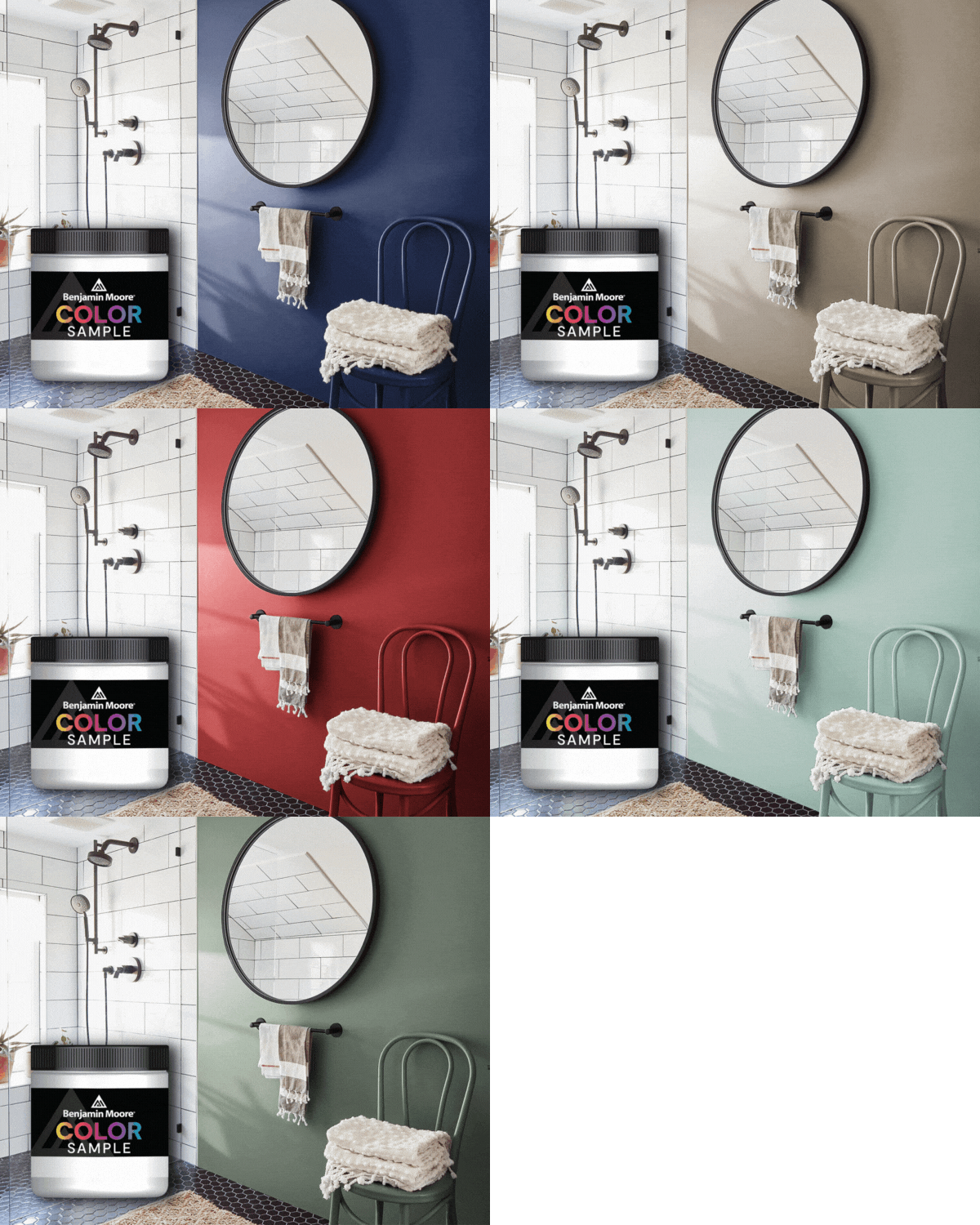
To bring the palette to life, use Silhouette as a focal wall color in a bedroom or living room, pairing it with Swiss Coffee trim for a soft, complementary contrast. This combination creates a sophisticated, layered space that feels warm and inviting. First Crush can be introduced on cabinetry or millwork, paired with Sherwood Tan accents, creating a subtle warmth and layered depth that demonstrates the palette’s versatility throughout a home.
Together, these colors form a palette that’s both classic and contemporary — a celebration of depth, texture, and thoughtful contrast.

A Year for Refined Comfort
With Silhouette AF-655 at its heart, the 2026 palette invites a return to balance: warmth without weight, softness with structure, elegance that feels effortless. It’s a reminder that true sophistication isn’t loud — it’s lived-in, layered, and deeply personal.


