


JC Licht's November Color of the Month: Randolph Gray CW-85
Randolph Gray, CW-85, by Benjamin Moore, is a rich, charcoal gray inspired by mid-18th century design. This article explores the history, key features, and practical uses of Randolph Gray Benjamin Moore to help you decide if it’s right for your next project.
Key Takeaways
-
Randolph Gray CW-85 is inspired by mid-18th century color palettes, perfect for creating warm and sophisticated interiors.
-
This versatile deep charcoal gray works well with various design elements, enhancing cohesion across spaces while maintaining historical charm.
-
Our recommended color pairings with Randolph Gray include Springfield Sage 510 and Shakespeare Tan 228.
Randolph Gray: A Mid-18th Century Shade
Randolph Gray reflects the sophisticated color palette prevalent during the mid-18th century, particularly in colonial Virginia. Named after Peyton Randolph, a prominent figure of the time, this shade pays tribute to the historical significance of colonial paint choices. Rich, muted tones like Randolph Gray were commonly favored for their ability to create a warm, inviting atmosphere, making them a staple in the homes of the era.
The color CW-85 mirrors the rich depth of a mid-18th century shade discovered at the Peyton Randolph House, emphasizing its historical roots. Part of the Williamsburg® Paint Color Collection, Randolph Gray aims to preserve the legacy of 18th-century design while offering a modern take on classic elegance. These historical influences make Randolph Gray a perfect choice for those looking to add a touch of timeless charm to their interiors.
Randolph Gray allows homeowners and designers to create spaces that evoke a sense of history and sophistication. This deep charcoal gray is not just a color; it’s a connection to the past, blending seamlessly with both traditional and contemporary design elements.
Deep Charcoal Gray Adds Historical Interest
The deep charcoal gray of Randolph Gray evokes a sense of timelessness, making it suitable for both classic and contemporary interiors. There are hints of green to this shade of gray that make Randolph Gray extra alluring with a dash of warmth. This versatile shade enhances architectural details and adds depth, complementing various design elements throughout the home. Whether used in high-traffic areas or as an accent, Randolph Gray brings a richly textured ambiance that is hard to match.
Gray paint unifies different spaces in a home, providing a consistent color theme that ties more than one room together. The softly polished glow of Randolph Gray can make colored ceilings and walls appear more cohesive, creating a seamless flow from room to room.
In natural light, Randolph Gray appears deeper, showcasing its rich charcoal hue with a whisper of olive green. Under artificial lighting, it feels more of a neutral charcoal gray. This adaptability makes it an excellent choice for any interior paint job, whether you’re refreshing a single room or redecorating your entire home.
Color Pairings with Randolph Gray
Pairing colors with Randolph Gray can elevate your interior design to new heights. This versatile shade pairs well with both warm and cool colors, allowing for flexibility in your design choices.
Considering the undertone of the associated colors helps create a harmonious and cohesive space.
Springfield Sage 510
Springfield Sage 510, when combined with Randolph Gray, creates a serene and cohesive space due to their similar undertones. This soft, natural green tone enhances tranquility and pairs beautifully with the deep charcoal gray, adding a touch of nature’s calmness to your interiors.
With a Light Reflectance Value (LRV) of 23.02, Springfield Sage reflects a small percentage of light, contributing to a cozy and intimate atmosphere. This hue is:
-
Categorized as an olive green softened by a hint of brown
-
Pairs well with colors like Swiss Coffee OC-45 and Steam AF-15
-
Versatile due to these complementary color options

Shakespeare Tan 228
Shakespeare Tan 228 adds warmth to the coolness of Randolph Gray, making it an excellent choice for creating inviting interiors. This rich, warm tone with golden undertones brings a balanced and inviting atmosphere, perfect for living rooms, dining rooms, and other communal spaces.
With a Light Reflectance Value (LRV) of 47.41, Shakespeare Tan reflects a moderate level of light reflected, making it a versatile and practical choice for various settings. Part of the Benjamin Moore Classics® Color Collection, this shade pairs well with colors like Cloud White 967 and Chantilly Lace OC-65, adding a timeless appeal to your design.

Combining with Trim Details and Crown Moldings
Combining Randolph Gray with trim details and crown moldings can significantly enhance the visual appeal of a space. Consider the following approaches:
-
Use a higher gloss finish for the trim to enrich the color and make the trim appear more substantial.
-
Opt for matte finishes to provide a softer look that complements the deep charcoal gray.
-
Paint the area between the crown molding and additional trim in a matching color to create an illusion of height in the room.
Gray as a backdrop allows for versatility in decor, pairing well with a variety of accent colors and styles. Complementary hues like creamy whites, soft greens, and muted blues can enhance the overall aesthetic appeal, making your space feel both cohesive and sophisticated.
Interior designers often recommend using the same finish for trim and crown moldings to create a uniform flat finish that flatters less-than-perfect surfaces. Whether you’re updating window frames or adding crown moldings, Randolph Gray provides a stunning backdrop that can unify your design elements and create an ultra flat, polished, cohesive look.
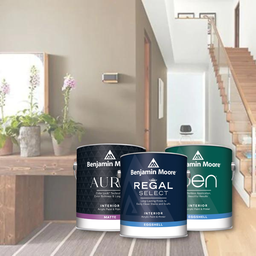
Regal Select Paint and Aura Paint Options
For those seeking premium paint options, Benjamin Moore offers Regal Select and Aura, both of which provide excellent coverage and superior quality. Regal Select paint incorporates a new high-performance resin, enhancing application ease and resulting in a smoother finish. This paint typically covers 400-450 sq. ft. per gallon, making it a cost-effective choice for larger projects.
Aura is Benjamin Moore's most premium option that reflects superior quality and performance. Known for its unbeatable durability and rich color, Aura Paint is designed to meet the precise paint needs of discerning homeowners and contractors. Like Regal Select, it provides excellent coverage of 350-400 sq. ft. per gallon and is formulated to deliver a smooth, even application, allowing you to experience premium performance with an almost iridescent quality.
Both Regal Select and Aura Paint are low-VOC interior paints, making them an environmentally friendly choice that doesn’t compromise on performance. Choosing these premium paints offers the benefits of high-quality, durable, and beautiful finishes for your interior paint jobs.
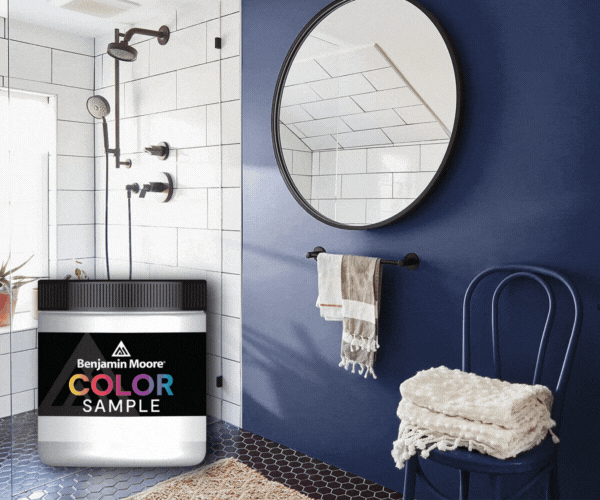
Try This Color at Your Local JC Licht
Ready to see Randolph Gray in your own space? Visit your local JC Licht store to get a half-pint sample today. With over 3500 Benjamin Moore colors available, all mixed in-store the same day, you can find the perfect shade to complement Randolph Gray and bring your vision to life.
Our knowledgeable staff can help you explore the full spectrum of colors, ensuring that you choose the perfect hues for your project. Whether you’re looking to refresh a single room or undertake a full home makeover, JC Licht is your go-to destination for premium paint and expert advice.


