


Key Takeaways
-
Benjamin Moore Natural Linen (966 / CC-90) is a warm, sandy beige with subtle green undertones and an LRV around 60, making it a light-medium neutral that avoids pink casts.
-
The green undertones help Natural Linen feel grounded and earthy rather than dated or overly warm.
-
Testing large samples in your own lighting is essential before committing—on-screen colors cannot capture how this beige will perform in your specific space.
What Is Benjamin Moore Natural Linen (966)?
Natural Linen is a soft, sandy neutral from Benjamin Moore’s classic color collection that delivers rustic warmth without feeling heavy or dated.
The overall look? Think relaxed elegance—a “lived-in” beige that feels light and fresh compared to the Tuscan golds and heavy taupes that dominated interiors in the early 2000s. This shade strikes just the right amount of warmth while maintaining enough sophistication for modern palettes.
Natural Linen is trending again as homeowners move away from stark whites and cool grays toward warmer, more grounded hues. Consumers are rediscovering that beige doesn’t have to be boring, and this particular shade proves it.
Designers consider Natural Linen a “safe choice” beige that still has character and depth. It’s not so neutral that it disappears, but it won’t overwhelm a room or clash with your existing finishes. That ability to balance presence with versatility makes it a go to option for professionals working with clients who want warmth without risk.

Color Characteristics: LRV, Undertones & Temperature
Understanding LRV and undertones helps predict how Natural Linen will look in different rooms—and more importantly, whether it’s the right fit for your space.
Light Reflectance Value (LRV)
Natural Linen has an LRV of approximately 59.84, positioning it as a light-medium color. For context:
This means Natural Linen feels light enough to keep rooms airy while providing more depth and presence than typical whole-house whites. It won’t wash out completely in bright light, but it also won’t darken a room the way mid-tone colors can.
Undertones
Here’s where Natural Linen gets interesting. The color possesses green undertones that occasionally flash peachy, though it definitively leans more toward green than peach overall. This green base prevents the color from appearing pink on walls—a common complaint with competing beiges.
The warm classification comes directly from these earthy tones rather than from yellow or orange. The result is a color that reads as “warm” to the eye while maintaining enough green saturation to stay grounded and avoid that dreaded pink cast.
Temperature Classification
Natural Linen sits firmly in warm-neutral territory:
-
Warmer than greige (gray-beige) options
-
Cooler than creamy off-whites like Linen White or White Dove
-
More yellow than gray-based neutrals
-
Less pink than many competitor beiges

How Natural Linen Performs in Real Rooms
Natural Linen changes with light, furnishings, and flooring, so room context matters more than the paint chip in your hand.
In bright, south-facing rooms: The color appears more washed, light, and creamy. It may read closer to a light tan or warm cream, losing some of its depth but gaining an airy, fresh quality.
In north-facing or low-light rooms: Natural Linen becomes richer and slightly more muted. Its green-beige character becomes more noticeable, creating a cozy, enveloping feeling that plays well in bedrooms and reading nooks.
With cool light (north or east exposure): The warmth of Natural Linen balances that coolness beautifully, preventing the space from feeling cold without turning yellow or orange.
With warm finishes (oak floors, beige carpets, travertine tile): Expect an especially cohesive, cozy result. The color picks up on these warm materials and amplifies the overall sense of warmth throughout the space.
In small, dark rooms with dark floors: Natural Linen may feel too heavy if combined with low ceilings and limited light. Test carefully in these conditions before committing.
Interior Uses: Where Natural Linen Works Best
Natural Linen excels in relaxing spaces where a soft, enveloping atmosphere is desired. It’s the kind of usable color that doesn’t demand attention but quietly elevates everything around it.
Many designers reach for Natural Linen in:
-
Bedrooms and guest rooms seeking restful ambiance
-
Bathrooms and powder rooms with existing warm tile
-
Home offices where focus and calm matter
-
Nurseries that need gentle, timeless appeal
-
Hallways connecting warm-toned living areas
In contemporary new builds with cool gray floors and bright, cool lighting, Natural Linen may look slightly muddier or out of place. Testing becomes especially important in these environments.
Coordinating Colors & Trim for Natural Linen
Natural Linen’s flexibility allows it to work with a variety of whites, colors, and materials. The key is understanding which combinations enhance its character versus which ones create undertone conflicts.

Coppertone 2161-10
Pairing Benjamin Moore Natural Linen with Coppertone 2161-10 creates a warm and inviting palette that balances soft neutrals with rich, earthy accents. Coppertone 2161-10, a deep, muted terracotta shade, complements the subtle green undertones of Natural Linen by adding depth and character without overwhelming the space.
This combination works particularly well in living rooms, dining areas, or accent walls where you want to introduce a touch of passion and sophistication. The warm, sandy neutral of Natural Linen provides a calm, versatile backdrop, while Coppertone’s earthy warmth brings life and texture, enhancing the overall cozy atmosphere.
To achieve a harmonious look, consider using Natural Linen on the majority of walls and trim, and introduce Coppertone 2161-10 as an accent color through furniture, cabinetry, or a feature wall. This pairing also pairs beautifully with natural wood finishes and soft textiles, creating a layered, elegant space that feels both timeless and modern.

Grand Canyon Red 2090-10
Grand Canyon Red is a rich, earthy red with subtle brown undertones, perfectly complementing the soft, sandy beige of Natural Linen. This combination evokes a natural, grounded feel reminiscent of desert landscapes, making it ideal for creating cozy, inviting rooms with a touch of bold character.
Use Natural Linen as the primary wall color to maintain a light, airy atmosphere, while incorporating Grand Canyon Red as an accent on feature walls, cabinetry, or decorative elements such as throw pillows and artwork. This pairing works beautifully with natural wood finishes and warm metals like brushed brass or bronze, enhancing the overall earthy palette. Whether in living rooms, dining areas, or bedrooms, the blend of these colors adds a sophisticated yet approachable vibe that feels both timeless and full of passion.
Best Trim Colors With Natural Linen
Trim choice dramatically affects how Natural Linen reads—crisper or softer, more modern or more traditional.
For fresh, modern contrast:Choose crisp whites like Benjamin Moore Chantilly Lace. The clean contrast creates definition and makes the beige feel contemporary.
For blended, traditional appeal: Warm whites like Cloud White, White Dove, or Simply White create a softer transition that feels collected and timeless.
For bold, dramatic spaces: Very dark trims in charcoal or black can be striking but may feel heavy in small rooms unless the style is deliberately bold and confident.
Match trim sheen (typically semi-gloss) across rooms for a cohesive appearance, even when wall colors change from space to space.
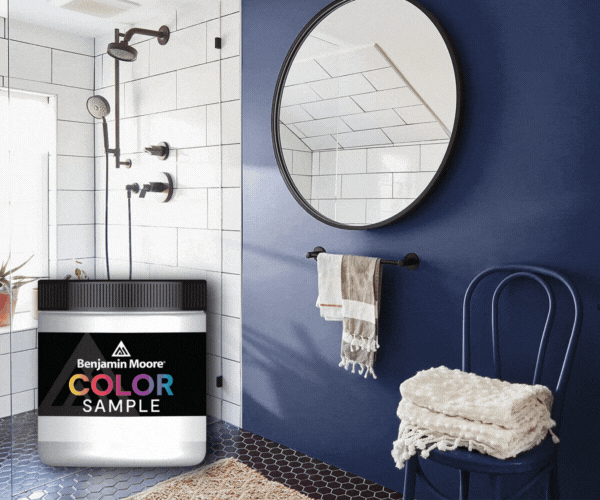
Sampling & Choosing Natural Linen
On-screen colors are unreliable. Samples are non-negotiable.
Best practices for sampling:
-
Use real paint on a sample board or use peel-and-stick swatches (Samplize and similar services make this easy)
-
Place samples on multiple walls in the room you’re considering
-
View at different times of day—morning, midday, evening, and under artificial light
-
Compare Natural Linen against at least one lighter and one darker alternative
-
Observe next to fixed finishes: floors, counters, tile, fireplace stone
-
Live with samples for several days before deciding
Watch for unexpected undertones that only appear when the sample meets your specific finishes. A beige that looks perfect in isolation might clash with your existing marble or fight against your flooring.
If doubt persists after sampling, a color consultation with a professional can save significant time and repainting costs. Sometimes a fresh perspective forward is all you need to feel confident in your choice.

Get Color Help At JC Licht
Choosing the perfect paint color can sometimes feel overwhelming, especially with a versatile shade like Natural Linen that changes subtly with lighting and surroundings. Scheduling a professional color consultation can provide valuable guidance tailored to your specific space, lighting conditions, and personal style.
During a color consultation, an expert will help you understand how Natural Linen will interact with your home's natural light, existing finishes, and furniture. They can recommend complementary colors for trim, accents, and furnishings to create a cohesive and harmonious palette. This personalized advice helps you avoid costly mistakes and ensures your project achieves the warm, inviting atmosphere you desire.
To schedule a consultation with us, visithttps://jclicht.com/pages/color-at-home to schedule online or by phone. Investing in a color consultation is a smart step toward creating a beautiful, timeless space that you'll love for years to come.


