


















We’ve been fangirling (and fanboying) all over Metropolitan AF-690, Benjamin Moore’s 2019 Color of the Year, but now it’s time to get down to brass tacks: using this phenomenal neutral in your home.
The understated Metropolitan lives to bring out the best in all the elements around it. Think cozy layers of gray to help a modern home find its softer side. Think fresh linens. Think reflective metallic accents. It can bring restorative quiet to a sleek kitchen or serenity against a bold backdrop. With its cool undertones, this sophisticated gray-blue babe becomes a total knockout when you accentuate the positive with light blue accessories, from pillows and lampshades to throw rugs and drapery.
Able to soften to matte or shimmer with sheen, Metropolitan holds the power to change appearance depending on the light exposure (must we dredge up that great blue/black or white/gold dress debate of 2015?). For example, it can actually take on an earthier, almost greenish personality on a south-facing wall bathed in warm sunlight. On a north-facing wall, you might see nuanced violet qualities emerge.
Of course, this chameleon-like trait is not unique to Metropolitan, as many interior paint colors tend to change with the angle and amount of sunlight throughout the day. When choosing a palette, remember:
- If your room faces south: Sunlight plays beautifully with both cool and warm colors, making the dark ones look brighter and the lighter ones seem luminescent. (Watch Metropolitan shine like the star it can be here.)
- If your room faces north: Warm colors offset what little natural light the space manages to get. (Metropolitan and, in fact, most colors in the gray spectrum, run too cool to be the dominant choice in rooms with grayish light. Instead, save it as an accent color.)
- If your room faces east: Blanketed by a gentle yellow warmth of morning light, the room gradually transitions to cool and blue as the day goes on. (Say yes to Metropolitan in this space.)
- If your room faces west: Diffused evening light adds warmth while lower-light hours earlier in the day can cause shadows and dulls some colors. (Use Metropolitan to add dramatic sparkle.)
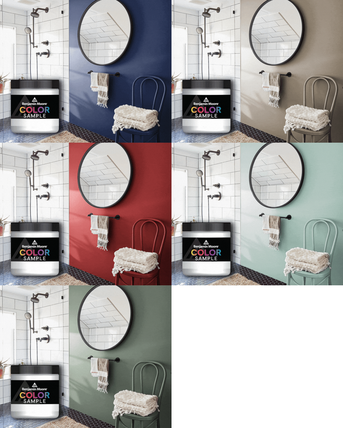
While we totally get how much Metropolitan AF-690 begs to be painted in a bedroom, kitchen or dining room, we highly recommend taking home a sampleto get better acquainted and see how it reacts in different locations and under different light. But by all means, do give it a try and discover all the ways this silver belle can transform a room from good to great.


