















Do you miss those iconic vibrant color palettes from the 1970s? Those inviting textures? Those groovy silhouettes? Introduce 1970s-inspired home décor into your modern home with the help of these tips from Sharon Grech, Benjamin Moore color and design expert.
COLOR
The 1970s retro feel featured bright hues and bold patterns. Add a modern spin to that eclectic look by:
-Pairing bright pops of color and pattern with neutral base colors such as black and white.
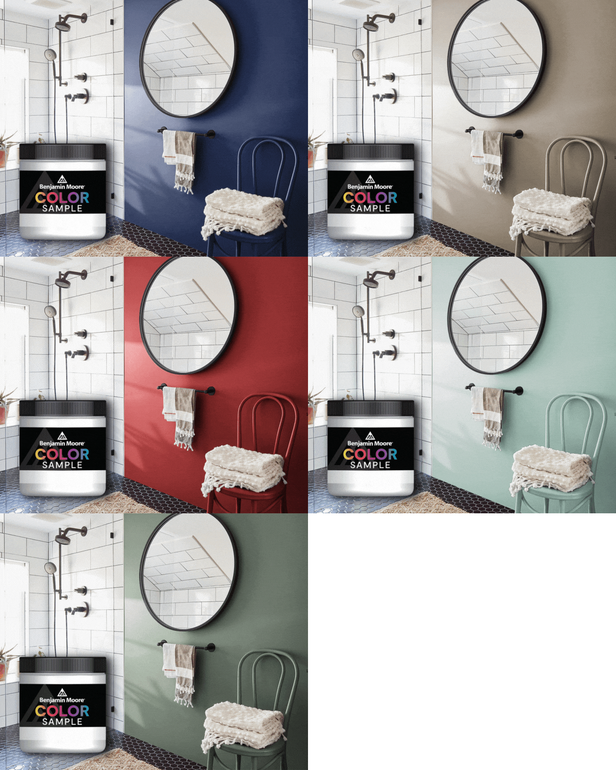
-Painting a statement wall your favorite color.
-Incorporating brightly painted furniture and accessories. Sharon suggests “For cool, trendy accents, I like Fiji AF-525. It’s a refined, earthy blue hue and really pops when paired with a black and white backdrop.”

FURNITURE
“A great way to accentuate retro décor is by adding fun, vintage furnishings,” explained Grech.
Look out for:
- Uniquely shaped pieces of furniture
- Asymmetrical consoles
- Geometric light fixtures in bright colors
- Bright colored furniture
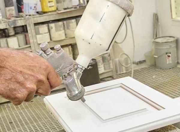
Right shape, wrong color? Add a fresh coat of paint to revitalize furniture you already have or just bought. “I always recommend using Benjamin Moore® ADVANCE® when it comes to painting furniture,” said Grech.
PATTERN
When it comes to 70s-inspired home décor, the more pattern, the merrier. Create the groovy look you love by mixing unexpected prints and patterns as a key design element. “Be sure to mix the scale of your patterned items and work with a consistent color palette throughout the room to keep a sophisticated look,” suggests Grech.
JC Licht makes color happen
JC Licht is a proud retailer of Benjamin Moore paints. Visit one of our 48 Chicagoland locations and let our experts help you get started on your DIY project. Need some help choosing the colors that are right for your space? Schedule and in home color consultation with our design expert.
SCHEDULE A HOME COLOR CONSULTATION FIND YOUR JC LICHT LOCATION


