


Shedding Light on Color: How Lighting Affects Paint Color in Your Space
Ever wondered why the paint color that looked perfect in the store suddenly seems off in your own space? The culprit is often lighting. This article dives into how lighting affects paint color, giving you the keys to unlock the true potential of paint in your home. From the golden hues of natural sunlight to the varied tones of artificial lighting, understanding this interplay is critical. Prepare to explore practical tips and expert insights that will guide you through choosing colors that stay true under any light.
Key Takeaways
- Lighting dramatically alters paint color perception, with natural light showing true colors in constant change, and artificial light impacting hue warmth and intensity.
- The color temperature of bulbs (measured in Kelvins) and their Color Rendering Index (CRI) directly influence how paint colors look in your home, affecting the mood and space ambiance.
- Sampling paint colors in your space is essential, as colors vary with different lights and times of day—pro tip: use big swatches and observe over a full day to get the full effect.
Illuminating the Impact: Understanding Light and Color Interplay
In the realm of interior design, lighting is an unspoken yet potent element that can redefine a room’s aesthetics without altering any objects. The interaction between light and paint color can be transformative—shades may dramatically change based on whether they’re under the afternoon sun’s golden rays or a strategically placed bulb’s soft glow. This delicate interplay requires keen observation and comprehension of how lighting affects paint color, as diverse light sources impact our color perception.
The search for the ideal wall color typically starts with a visit to the paint store, clutching swatches. However, if you overlook the lighting aspect, you might realize that the carefully selected hues look somewhat different once they’re on your walls.
Here are some tips to consider when choosing wall colors:
- Natural light reveals the most authentic color, but it fluctuates significantly throughout the day and based on its entrance direction into a room.
- Artificial light can either enhance or clash with natural light, literally casting shades in an entirely new perspective.
- By merging natural light with judiciously chosen artificial lighting, you can manipulate the ambiance of your spaces, making color selection a more purposeful and gratifying experience.

The Influence of Natural Sunlight on Wall Colors
As the sun makes its daily journey across the sky, its rays touch our walls with varying warmth and intensity. East-facing rooms capture the morning light, basking in a soft, warm glow that makes dark colors come alive with vibrancy. Yet, as the day progresses, these same hues might take on a more subdued tone as the light fades. Conversely, the south-facing walls bear the brunt of the sun’s most intense natural light, which can make lighter paints seem almost ethereal, while darker shades soak up the brightness, becoming even more profound.
Come evening, the westward turn bathes rooms in a golden or reddish hue, enriching warm paint colors and adding a cozy ambiance to your space. North-facing rooms, however, present a unique challenge with their consistent, indirect natural light that can mute light colors and deepen dark ones, often requiring a more deliberate choice of shade to achieve balance. Understanding these nuances of natural sunlight ensures that the paint colors you select will reflect your desired aesthetic at any time of day.
Decoding Artificial Light: Bulbs and Paint Perception
Understanding basic light bulb terminology can help you make informed decisions when it comes to choosing the right bulbs for your home. The bulbs that light our homes at night have their language of colors, spoken through Kelvins and CRI ratings. The temperature of a bulb, measured in Kelvins, influences whether a space feels invitingly warm or crisp and cool. Lower Kelvin temperatures evoke the coziness of incandescent bulbs, casting a warm light that can make paint colors appear more rich and layered. Higher temperatures, meanwhile, lean towards the blue end of the spectrum, potentially casting cooler tones over your walls and affecting the color’s true appearance.
Understanding the color temperature is vital, as is comprehending a bulb’s Color Rendering Index (CRI), which indicates its capability to display paint colors in their most genuine form. Imagine the soft whites in your bathroom under a bulb of 4300-5000K, where cool paint colors look fresh and invigorating, while warm tones might lose their luster.
The key to maintaining the integrity of your chosen paint colors under artificial light is to match the lighting temperature to the mood you wish to create, whether it’s the lively ambiance of a kitchen or the tranquil retreat of a bedroom.
Balancing Act: Combining Natural and Artificial Lighting
Achieving a balanced interplay between natural daylight and artificial light is a feature of a well-crafted room. It involves striking a balance between the two, accentuating daylight’s natural beauty while compensating for shadows with thoughtfully chosen artificial sources. Designers often experiment with both to bring out the best in paint and textile colors, ensuring that each complements the other and adapts to the changing light conditions throughout the day. The result? A space that feels balanced, cohesive, and thoughtfully illuminated.
In practical terms, this implies evaluating paint samples under both light types, given that a color appearing ideal under the afternoon sun may exhibit a completely different persona under the radiance of LED bulbs. Paint consultants painstakingly consider the direction of natural light entry, customizing color selections to account for subtle shifts that can enhance or diminish a paint’s appearance. By paying attention to these details, you can create a space that maintains its intended color scheme from the bright morning light to the soft evening hues.

The Science of Reflection: How Paint Colors Respond to Light
In essence, the colors we perceive are reflections of the light that hits our eyes. The light reflectance value (LRV) of a paint color plays a significant role in how it interacts with light and, consequently, how it appears on our walls.
Here are some key points to understand about LRV:
- Dark colors have a lower LRV and tend to absorb more light, making them appear less intense in spaces with limited natural light.
- Light colors have a higher LRV and reflect more light, making them appear brighter and more vibrant.
- The LRV measures the percentage of light a color reflects—the higher the value, the more light it reflects.
Understanding the LRV of a paint color can help you make informed decisions about the colors you choose for your space.
This is where the quality of artificial light comes into play. To ensure that a color shines in its truest form under artificial lighting, it’s best to use light bulbs with high Color Rendering Index (CRI) ratings, which provide an intense light.
Light and color are in constant conversation within our homes, and understanding this dialogue is key to creating spaces that look and feel exactly as we intend them to.
Light Colors and Bright Spaces: Maximizing Reflectivity
Light colors are the secret to creating rooms that feel airy and spacious. These hues possess higher LRVs, meaning they reflect a substantial amount of light and, in turn, can make a room appear larger and more open. It’s not just about perception; light colors genuinely bounce more light around a room, enhancing brightness and giving an illusion of expansiveness. This is particularly beneficial in areas that may lack ample natural light, where light colors can compensate by maximizing reflectivity. Some examples of light colors that can help create this effect are:
By using these light colors in your home, you can create a sense of openness and brightness, even in rooms with limited natural light.
The gloss level of your paint also plays a role in how light interacts with color. A higher gloss finish will reflect more light, adding a vibrancy and luminosity to the color that matte finishes can’t match. When choosing paint for a dimly lit room or one you wish to feel a bit brighter, consider opting for lighter shades with a hint of gloss. It’s a simple yet effective way to manipulate light and enhance the visual size of your space.

Darker Hues Under the Spotlight: Absorption and Intensity
While light colors play with light, darker hues engage with it in a different manner. Dark colors absorb light, which can sometimes make them appear less vibrant on walls, affecting both their intensity and the room’s overall feel. To counter this effect, especially in rooms that receive less natural light, opting for bulbs with higher lumens can enhance the depth and richness of dark paint colors. This careful consideration of lighting can turn a potentially flat and dim space into one that is dynamic and full of character.
Seasonal changes can further complicate the relationship between dark colors and light. During months with shorter days and less intense natural light, brighter bulbs become even more crucial to maintain the vibrancy of typically darker hues. By pairing dark paint colors with the right artificial lighting, you can ensure that their beauty is consistently revealed, regardless of the time of year or the amount of sunlight available.
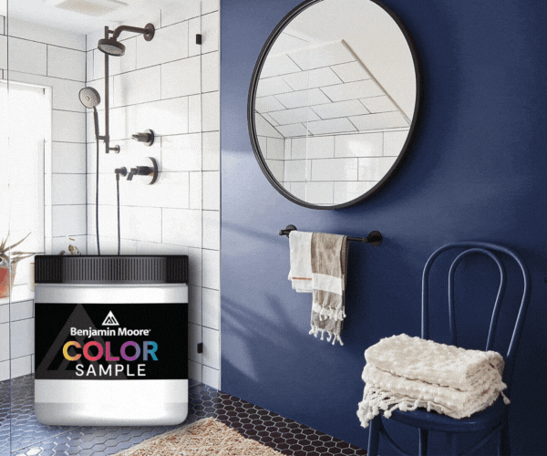
The Art of Sampling: Testing Paint Colors in Your Space
Before settling on a paint color for your walls, it’s crucial to sample it in the intended space. Paint experts often advise using larger paint samples rather than small swatches to get a true sense of how colors will look in a room, as lighting plays a crucial role in color perception. It’s not just about how a color looks at a single moment but how it will appear throughout the day and in different lighting conditions. By testing paint colors in your home, you can make an informed decision that ensures the hues you choose will bring your vision to life.
Testing paint colors is not merely a step in the procedure—it’s an art in itself. Moving samples around the room to observe how they change with natural and artificial light can reveal surprising variations and nuances. This hands-on approach not only helps you see the potential of a paint color but also prevents that common pitfall of a hue that seemed perfect in the store but feels out of place in your home. Sampling is the key to unlocking a color’s true personality and ensuring it complements your space in every light.

Summary
Throughout our exploration of light and color, we’ve uncovered the nuances of how paint colors respond to different lighting conditions and the transformative effects they can have on our spaces. From the soft glow of natural daylight to the tailored ambiance of artificial lighting, understanding these dynamics is crucial for creating interiors that evoke the intended mood and style. By considering the direction of light, the color temperature of bulbs, and the seasonal changes in lighting, we can make informed decisions that bring out the true beauty of our chosen paint colors.
As we draw our journey to a close, let it be with a newfound appreciation for the interplay between light and paint and the confidence to experiment within your own home. Remember, the right lighting can elevate a color from simply being seen to being felt, transforming a space into a reflection of your personal taste and lifestyle. Embrace the art of sampling, seek professional insight, and let your space shine in its best light.


