


Benjamin Moore Nicolson Green is a deep, sophisticated green perfect for adding historical charm to modern spaces. Find out why it’s a top choice for elegant interiors.
Key Takeaways
-
Nicolson Green is a rich, deep green color that embodies wisdom and sophistication, making it suitable for elegant and masculine spaces.
-
The paint has a Light Reflectance Value (LRV) of 21.68, which creates an intimate atmosphere, enhancing its velvety richness and sophistication in various lighting conditions.
-
Nicolson Green is part of the historically inspired Colonial Williamsburg revival color palette, allowing homeowners and designers to connect with American history while creating modern, timeless interiors.
Discovering Nicolson Green
Nicolson Green stands out as a deep shade of green that conveys both wisdom and sophistication. Part of the Colonial Williamsburg revival color palette, this hue reflects the rich traditions of 18th-century paint practices, bringing a touch of historical elegance to modern interiors. The pigment used in Nicolson Green is rooted in the past, yet it effortlessly complements contemporary design aesthetics.
This deep green hue is particularly appealing to those who gravitate towards a masculine aesthetic. You can feminize the color by adding pops of color for a maximalist or glam aesthetic. Its rich color suggests strength and maturity, making it an excellent choice for spaces that aim to exude a sense of wisdom and stability. Whether you’re designing a study, a library, or a dining room, Nicolson Green has the power to transform ordinary spaces into areas of contemplation and elegance.
One of the key characteristics of Nicolson Green is its Light Reflectance Value (LRV) of 21.68. This indicates that it reflects a moderate amount of light, which can significantly impact how the color is perceived in different lighting conditions. A lower LRV like that of Nicolson Green can create a more intimate and cozy atmosphere, perfect for spaces where you want to promote relaxation and conversation. The interplay of light and shadow on this deep hue adds to its velvety richness, further enhancing its appeal.
Nicolson Green suggests wisdom and maturity. Its deep, velvety hue anchors a room, enhancing other design elements and furnishings. Choosing Nicolson Green means embracing a legacy of refinement and sophistication.

Colonial Williamsburg's Revival Color Palette
Nicolson Green's inclusion in the Colonial Williamsburg revival color palette is a testament to its historical significance and enduring appeal. This collection of colors is meticulously curated to reflect the rich heritage of Colonial Williamsburg, aiming to recreate the authentic aesthetic of 18th-century Virginia. Choosing Nicolson Green connects you with a piece of American history.
The Williamsburg color palette serves a dual purpose. It provides interior designers and homeowners with colors that are both historically accurate and aesthetically pleasing. These colors, including Nicolson Green, help to educate the public about historical trends while allowing them to incorporate a sense of historical continuity into their modern spaces. The result is a design that resonates with both beauty and significance.
Benjamin Moore’s collaboration with Colonial Williamsburg revival color palette offers an array of historically inspired hues that bring the past to life in today’s interiors. Nicolson Green, with its deep, velvety richness, stands out as a color that embodies the essence of colonial design while fitting seamlessly into contemporary settings. This harmonious blend of old and new makes Nicolson Green a perfect choice for those looking to create elegant and timeless spaces.
Precision in Application
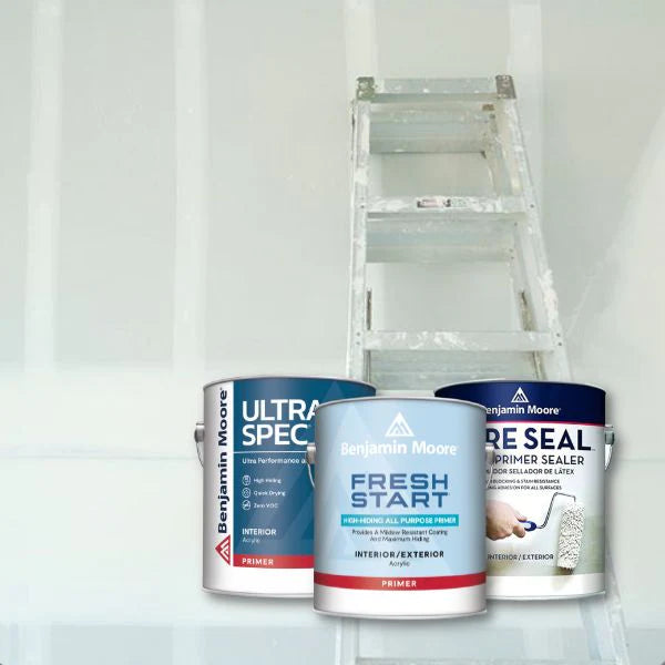
Achieving the best results with Nicolson Green requires attention to detail and precision in application. High-quality tools are essential for a smooth and even finish. Synthetic brushes and foam rollers are particularly effective in ensuring that the paint glides on effortlessly, reducing the likelihood of streaks and brush marks. Investing in the right tools ensures Nicolson Green’s velvety richness is fully realized on your walls.
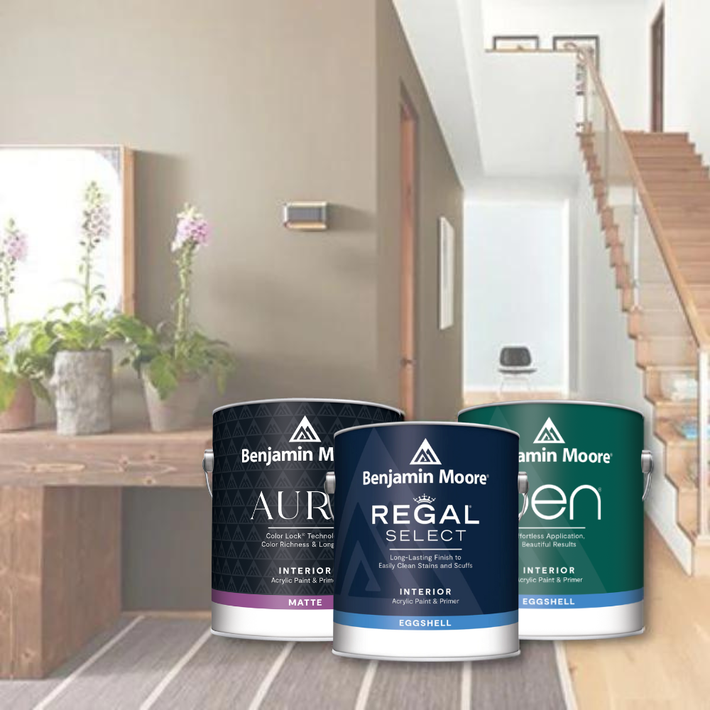
To obtain a uniform color and finish, it is advisable to apply two thin coats of Nicolson Green rather than one thick coat. This method allows for better coverage and a more even appearance. Additionally, using painter’s tape along edges can help achieve clean lines and a professional look. For larger areas, a paint sprayer can be a useful tool, providing a smooth and consistent application that minimizes the appearance of roller marks.
Precision in application extends beyond just the tools and techniques. It involves a steady hand and even pressure to avoid streaks and achieve a flawless finish. Proper preparation and careful application method ensure precise paint needs are met, providing a rough estimate of the effort required to transform your space into an elegant and sophisticated haven.
Complementary Colors and Pairings
Nicolson Green’s deep hue makes it a versatile choice that pairs beautifully with a variety of complementary colors. Complementary colors, found opposite each other on the color wheel, create striking contrasts that enhance the visual energy of a space. Careful selection of colors that complement Nicolson Green results in a dynamic and visually appealing design.
Using complementary colors not only enhances the aesthetic appeal but also adds depth and dimension to your interiors. These color pairings can transform a room, making it feel more vibrant and balanced. Whether you’re aiming for a bold contrast or a subtle harmony, the right complementary colors can make all the difference.
Two standout complementary colors that pair exceptionally well with Nicolson Green are Modern Romance CSP-435 and Purplicious CSP-465. These hues provide a perfect balance, enhancing the richness and sophistication of Nicolson Green while adding their unique charm to the overall design.

Modern Romance CSP-435
Modern Romance CSP-435 is a warm red that evokes the color of passionately crushed rose petals. This amorous yet not overly sentimental shade inspires feelings of passion and warmth, making it an excellent choice for intimate spaces. When paired with Nicolson Green, Modern Romance adds a touch of warmth and depth without overwhelming the room.
This deep red hue complements the deep green of
Nicolson Green, creating a balanced and harmonious look. The combination of these colors can transform any space into a cozy and inviting retreat, perfect for creating an intimate atmosphere that encourages relaxation and connection.

Purplicious CSP-465
Purplicious CSP-465 is a rich purple shade that embodies the essence of juicy grapes and berries freshly pressed into paint. This luscious color provides a sense of creativity and luxury, making it an ideal choice for artistic environments. When paired with Nicolson Green, Purplicious adds a touch of opulence and sophistication to the space.
The luxurious feel of Purplicious complements Nicolson Green’s deep hue, creating a dynamic and visually appealing contrast. This combination can transform a room into a stylish and elegant space that exudes creativity and refinement.
Try This Color At Your Local JC Licht
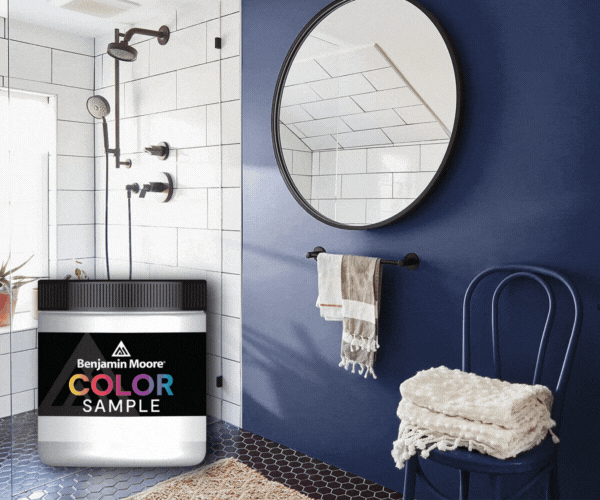
To truly appreciate the beauty of Nicolson Green, seeing it in person is essential. Visit your local Chicagoland JC Licht location to get a half-pint sample of any Benjamin Moore color, including Nicolson Green, the same day. This allows you to test the color in your own space, under your specific lighting conditions, to ensure it’s the perfect fit.
Trying a sample first can help you visualize how Nicolson Green’s deep, velvety richness will look in your home. Whether you’re considering it for a more masculine shade or a space that needs a touch of sophistication, experiencing the color firsthand can make all the difference in your decision-making process.


