















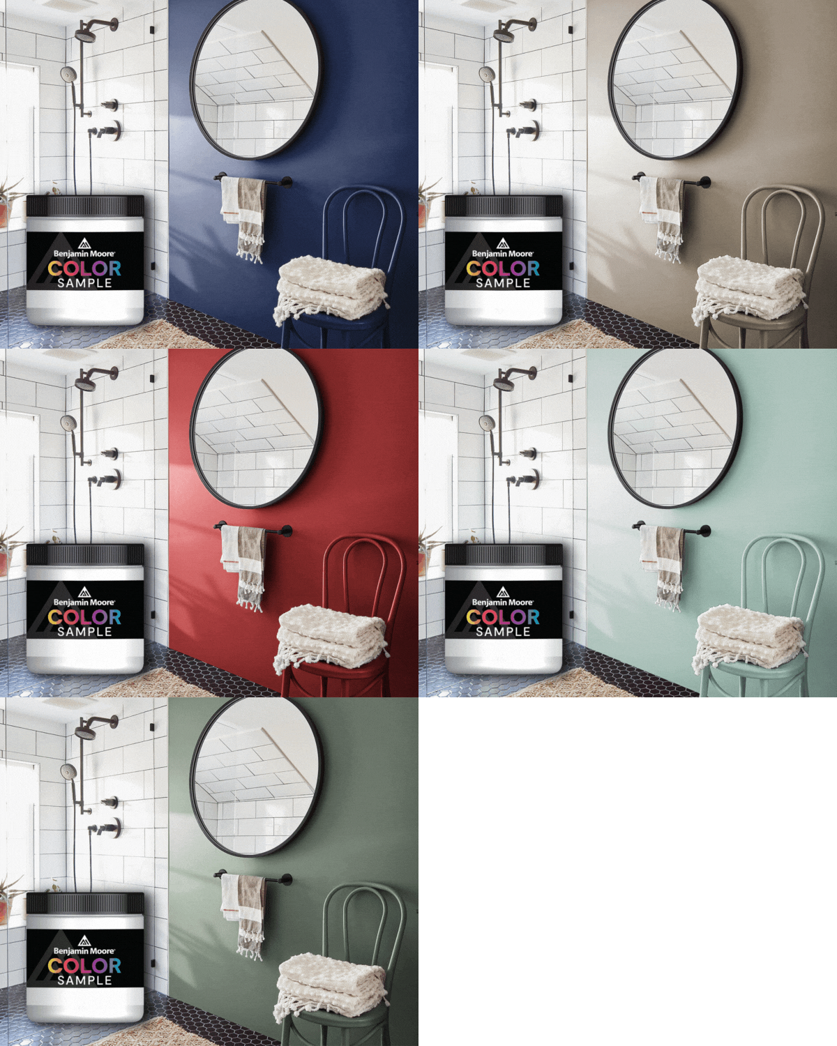


Every month, JC Licht celebrates a standout hue from Benjamin Moore’s exceptional palette, and this February, we are thrilled to feature Wynwood 1231 as our Color of the Month. With its rich, inviting warmth and timeless versatility, Wynwood 1231 is a shade that transforms spaces into sanctuaries. Let’s explore what makes this color so special and how it can bring elegance to your home.
The Essence of Wynwood 1231
Wynwood 1231 is a sophisticated and grounding shade, exuding a warm brown undertone that makes it both modern and classic. Its deep yet approachable nature creates an atmosphere of comfort and stability, making it a perfect choice for the cooler months when cozy interiors take center stage.
Wynwood 1231 shines in spaces designed for connection and relaxation, such as living rooms, bedrooms, and dining areas. Its depth and warmth bring a sense of intimacy, whether used as the main wall color or as an accent.
This shade evokes a sense of elegance and timelessness, making it a go-to choice for those looking to create an inviting and stylish retreat.
Color Pairings with Wynwood 1231
Creating a harmonious color palette is essential for maximizing Wynwood 1231’s impact. Here are two standout Benjamin Moore shades that pair beautifully with this February favorite:

Philipsburg Blue HC-159
Philipsburg Blue HC-159, a classic and crisp blue, provides a balanced contrast to Wynwood 1231’s warmth. The combination of these two shades creates a dynamic and grounded palette that feels fresh yet timeless.
Consider using Wynwood 1231 on the walls of a living room or study, paired with Philipsburg Blue on cabinetry, built-ins, or furniture. The result is a cohesive and polished space with a touch of boldness.

Glowing Umber 182
Glowing Umber 182 enhances the earthy elegance of Wynwood 1231. Its warm, terracotta undertones complement the richness of Wynwood, creating a monochromatic palette that is both inviting and chic.
Use Wynwood 1231 as the primary wall color and Glowing Umber on trim, accent walls, or even in your textiles and decor. This pairing works especially well in bedrooms and dining areas where warmth and depth are desired.
Styling Tips and Decor Ideas
To highlight Wynwood 1231’s beauty, consider incorporating the following design elements:
-
Metallic accents like bronze, gold, or brushed brass add a touch of luxury to the warm undertones of Wynwood 1231.
-
Plush fabrics like velvet or suede in complementary tones, along with natural wood finishes, enhance the color’s coziness.
-
Experiment with warm lighting to deepen Wynwood’s rich tones or cooler lighting for a more modern look.
Why Choose Benjamin Moore Paints?
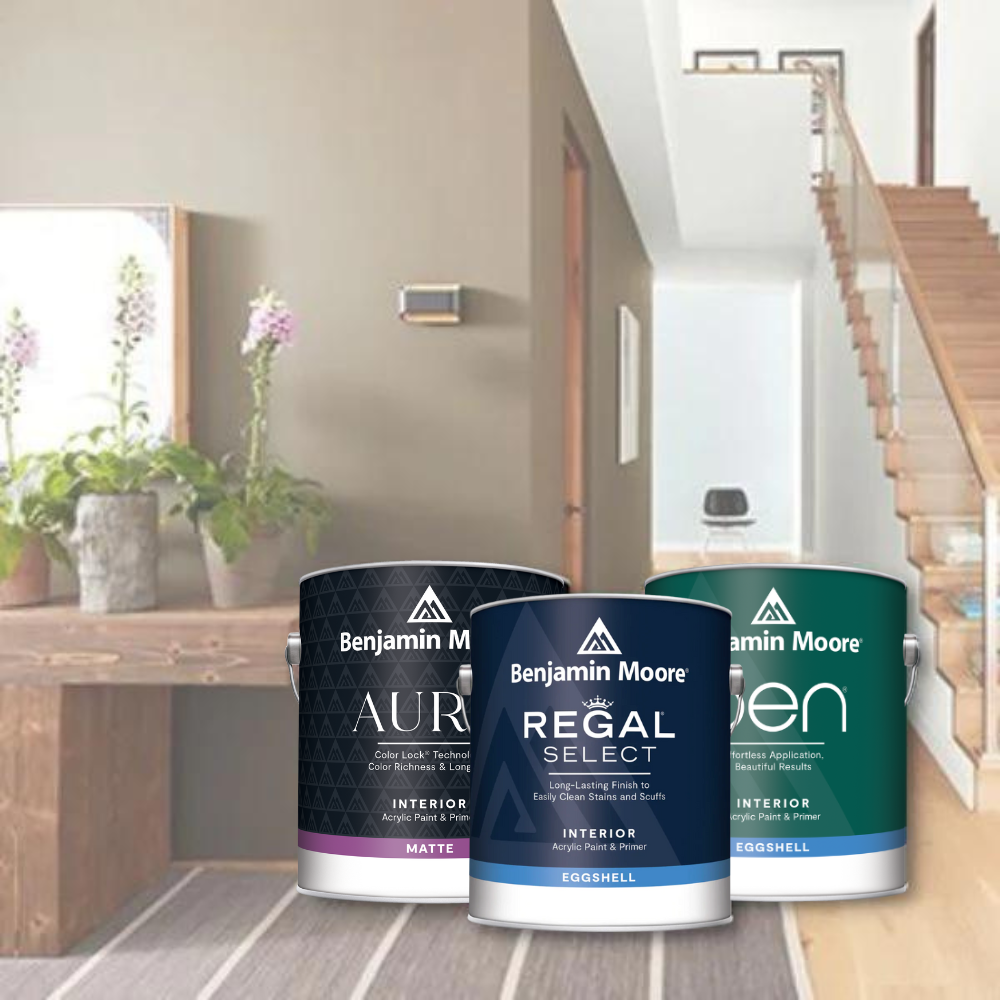
Selecting the right paint is as crucial as picking the right color. Renowned for quality and performance, Benjamin Moore paints are preferred by both professional contractors and DIY enthusiasts. A standout feature is the use of proprietary resins and colorants, optimizing performance and ensuring exceptional application properties and durability.
Using high-quality paints with premium ingredients significantly increases durability and resistance to environmental factors. This ensures your interior paint job looks fresh and vibrant for years, providing excellent value for your investment. Wall paint from Benjamin Moore is easy to clean, making maintenance simple and keeping your home looking its best.

Experience Wynwood 1231 at JC Licht
At JC Licht, we’re passionate about helping you bring your vision to life. Visit one of our stores to experience Wynwood 1231 in person and see how it interacts with different lighting and decor. Our expert team is here to provide personalized advice, from color consultations to product recommendations.
Want to test Wynwood 1231 in your space? Take home a paint sample or try the Benjamin Moore Color Portfolio app to visualize it in your room.


