




Benjamin Moore's 2019 Color of the Year | JC Licht

SAVE 10% OFF* ONLINE EVERYDAY!

Benjamin Moore’s 2019 Color of the Year

  • 1 min read

Check out the Color of the Year 2019 as well as all of the color trends at any of our JC Licht locations

We’re loving the 2019 Benjamin Moore Color of the Year! Metropolitan AF-690 is a stylish, neutral gray with cool undertones.

“Metropolitan AF-690 emanates nuance, harmony and extravagant ease.
Always adaptable, it softens to matte or shimmers with sheen.
It’s neutral. It’s understated. It just is.
This is color, off-duty.”
—Ellen O’Neill, Benjamin Moore & Co.

On Trend

Metropolitan radiates beauty and glamor. It’s serene, soothing and effortlessly sophisticated.

Metropolitan AF-690 is supported by Color Trends 2019, a coordinating palette of 15 harmonious hues.

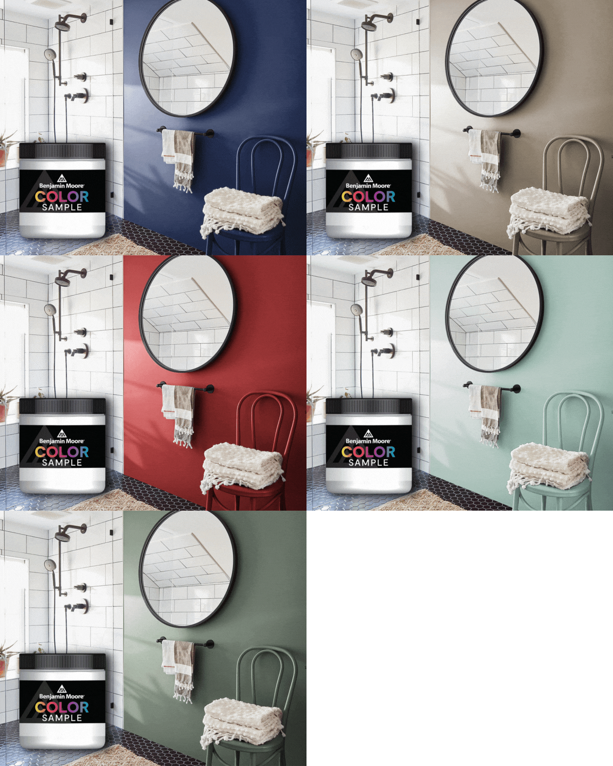
Benjamin Moore's 2019 Color Trends Palette

Pairs Perfectly

This particular gray is elegant yet modern.

It offers a twist on the standard neutral and will create a calming effect to any space in your home.

It provides the perfect backdrop to add a pop of color, like Navy or really any other color you choose! Add a colorful accent chair or throw pillows and watch your room come to life.

Metropolitan AF-690 in a living room

JC Licht Makes Paint Happen

If you have any questions about Metropolitan AF-690, the paint experts at JC Licht are ready to help! Stop by one of our Chicagoland neighborhood stores and tell us about your project. Needing some help choosing the right colors for your home? Scheduled an in-home color consultation with our color expert.

Some colors and patterns have a way of making a space feel instantly more personal. This month, we're drawn to the richness of deep greens, the enduring appeal of heritage design, and wallcoverings that turn everyday rooms into something worth remembering. From fresh perspectives on classic style to expressive new patterns, November's edit is all about creating spaces with character.

  • 5 min read

Benjamin Moore Navy Masterpiece 1652 is a bold, blackened teal that brings depth, drama, and timeless sophistication to any space. With its rich blue-green undertones and painterly character, this moody hue makes a striking statement on walls, cabinetry, and accent features. Discover how to pair Navy Masterpiece with warm neutrals, earthy browns, and natural textures to create a beautifully layered palette for fall.

  • 6 min read

Every month, our design team looks across what’s new from our vendor partners and pulls out what feels genuinely worth specifying. This month’s throughline: richer color, tactile materials, and layered pattern that bring depth, warmth, and character to a space.

  • 4 min read

Already know what you need?