


JC Licht’s March Color of the Month: Benjamin Moore’s Woodlawn Blue HC-147
Imagine a paint color that shifts with the daylight, offers serene sophistication, and complements diverse design aesthetics. Benjamin Moore Woodlawn Blue is that color. This guide will reveal how it calibrates with light, complements multiple decor styles, and why it stands out as the Color of the Month.
Key Takeaways
- Woodlawn Blue HC-147 offers a serene, calming effect with chameleon-like undertones, making it suitable for various interior design styles and light conditions.
- With an LRV of 60.65 and available in multiple sheens, Woodlawn Blue is practical for different rooms and surfaces, aiding in light reflection and offering diverse finishes for traffic and cleaning needs.
- Benjamin Moore’s Woodlawn Blue pairs brilliantly with colors like Concord Ivory and Cedar Key, enhancing spaces with a harmonious blend and is backed by the quality of Benjamin Moore’s eco-friendly, cutting-edge paint technology.
Exploring the Serenity of Benjamin Moore Woodlawn Blue HC-147
Imagine the serene essence of a tranquil blue-green sea bathed in soft sunlight. This is the calming effect that Woodlawn Blue HC-147 imparts to a space. Part of Benjamin Moore’s Historical Collection, Woodlawn Blue transcends fleeting design trends with its timeless appeal.
Woodlawn Blue’s versatility stems from its harmonious fusion of green, turquoise, and gray undertones, making it suitable for a variety of interior design styles. Whether you’re going for a modern farmhouse aesthetic, a classic look, or a coastal theme, this paint color can seamlessly tie your décor together.
The Influence of Light on Woodlawn Blue's Dominant Tone
Woodlawn Blue’s allure is rooted in its chameleon-like nature. Depending on the lighting conditions, its dominant tone can vary from a bright blue-green to a soft light blue/gray. Basked in natural daylight, Woodlawn Blue reveals its gray undertones. However, under artificial lighting conditions, the blue-green notes come through stronger.
The subtle tonal shifts of Woodlawn Blue imbue each space with a unique character and mood, creating a softly polished glow.
Maximizing Woodlawn Blue in Various Rooms
Few colors rival the versatility of Woodlawn Blue. Its soothing blue-green hue can complement a range of interior design styles, from traditional to modern farmhouse, and even coastal themes. Imagine stepping into a bathroom painted in Woodlawn Blue, instantly evoking a spa-like retreat. Or a kitchen where Woodlawn Blue is paired with white cabinetry and marble countertops, creating a clean, airy atmosphere.
In bedrooms, Woodlawn Blue works like a charm, enhancing relaxation and setting up a calm sleeping environment. For living rooms, it creates a warm and inviting atmosphere, making the area cozy and welcoming. Whether you have light wood or dark hardwood floors, Woodlawn Blue can seamlessly blend in, enhancing the overall ambiance. Beyond the walls, this color can also be applied to studies and even cabinetry, making it a multifaceted option for numerous home environments.
March's Color of the Month: Celebrating Woodlawn Blue
As we welcome the invigorating spirit of spring, we honor Woodlawn Blue HC-147 as our color for March. With spring cleaning in full swing, it’s the perfect time to consider a fresh coat of paint that breathes new life into your space. And what better color to choose than one that enhances your spaces with a serene and calm atmosphere?
Hence, this spring let’s embrace the soothing charm of Woodlawn Blue.
The Technical Side of Woodlawn Blue HC-147
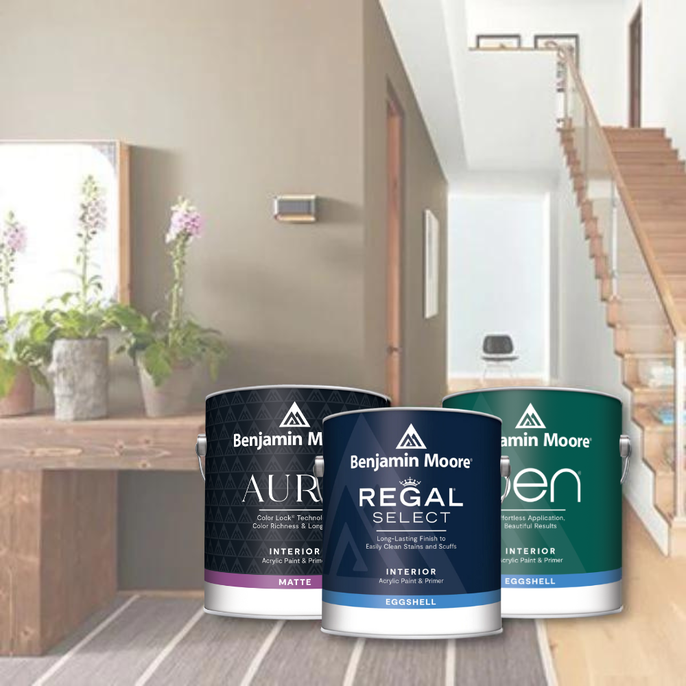
Apart from its soothing color and adaptable appeal, Woodlawn Blue HC-147 is available in multiple sheens to cater to a range of preferences and applications. Whether you prefer the subtle elegance of a flat finish or the easy-to-clean durability of a semi-gloss finish, you’ll find a sheen that matches your needs.
One of the most favored finishes for interior paint is eggshell, known for its soft, low-sheen appearance that hides minor wall imperfections while providing a washable surface. Flat paint, on the other hand, offers a matte finish and is another popular choice for interior spaces.
Light Reflectance Value (LRV) and Coverage
Grasping the technical nuances of paint color can streamline your painting project and yield better results. One such aspect is the Light Reflectance Value (LRV). Woodlawn Blue HC-147 has an LRV of 60.65, categorizing it as a mid-tone color. But what does this mean for you?
An LRV of 60.65 means that Woodlawn Blue can reflect a good amount of light, potentially affecting the perception of space. If you are painting a very light or off-white wall, Woodlawn Blue would cover it well. We recommend always using a primer even if your new color will be slightly darker than the old color.
Choosing the Right Sheen for Your Space
Selecting the appropriate sheen for your paint can significantly influence the final appearance of your room. From flat to semi-gloss, Woodlawn Blue HC-147 is available in a range of finishes to suit your room’s traffic and cleaning requirements. For ceilings and less-trafficked areas, a flat finish is often preferred as it can help hide wall imperfections while offering a rich depth of color. If you prefer a bit of shine and want a finish that can withstand gentle scrubbing during cleaning, a matte finish is the way to go. Additionally, using a high-quality waterborne ceiling paint specifically formulated can further enhance the overall look of your space.
For moderate-traffic areas, an eggshell finish is the industry standard as it provides a slightly shiny surface that is easy to clean. If you’re painting a high-traffic area like a kitchen or bathroom, consider a satin finish that offers a smooth, cleanable surface. For a more subtle look, a uniform flat finish can be an alternative option in certain spaces.
For busy areas like hallways and common rooms, a pearl finish can add both splendor and practicality. And if you’re painting moldings and trim that are subject to frequent cleaning, a satin finish is the recommended choice for its high durability and ease of cleaning.
Pairing and Accentuating Woodlawn Blue
The possibilities for color pairing with Woodlawn Blue are boundless. Whether you’re looking to create a calm and serene environment or wanting to add a pop of color, this versatile hue can work wonders. It pairs beautifully with a coastal-inspired color palette, coordinating well with:
- shades of terracotta
- warm beige
- tan
- brown
And if you’re feeling adventurous, you can even pair it with colorful nature-inspired prints for wallpaper or sunshine-toned accents.
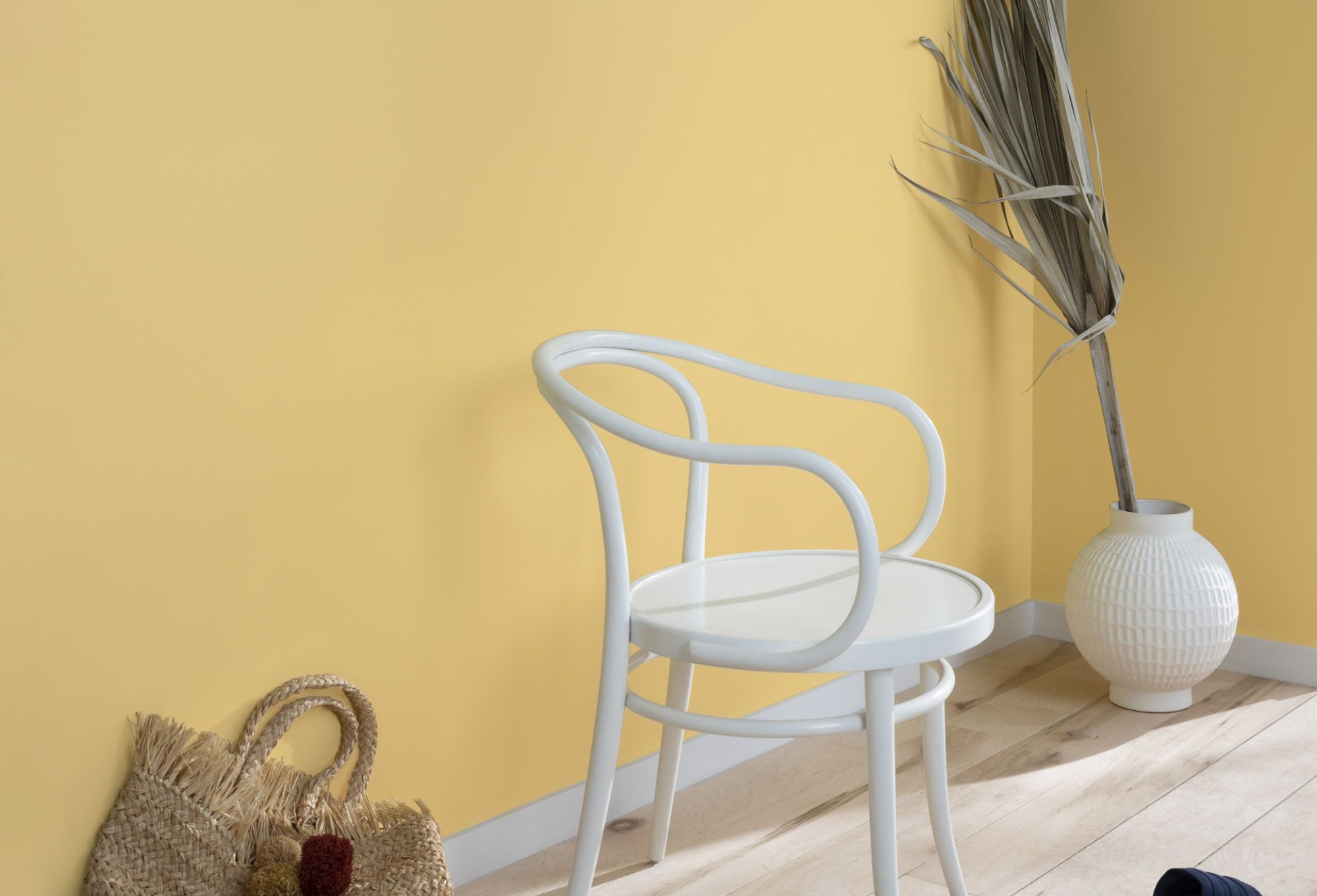
Concord Ivory HC-12
One color that complements Woodlawn Blue beautifully is Concord Ivory HC-12. This sophisticated yellow-gold hue comes with quiet apricot undertones, adding a warm and inviting look to any space.
Coupled with Woodlawn Blue, it cultivates a harmonious contrast that is simultaneously captivating and calming.
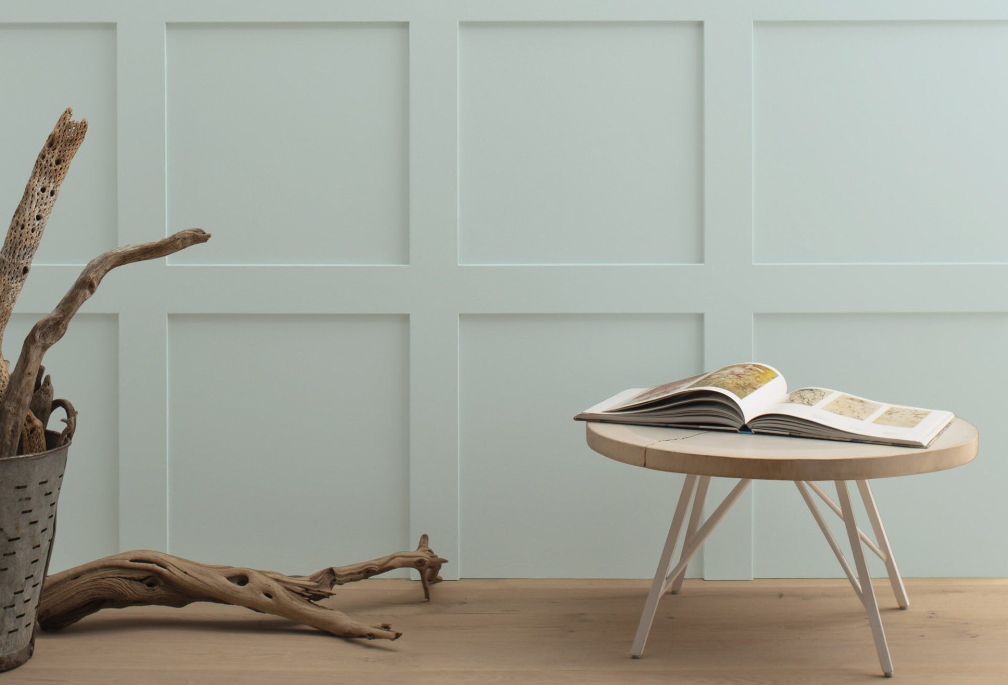
Cedar Key OC-16
Another color that pairs well with Woodlawn Blue is Cedar Key OC-16. This crisp, confident neutral color is reminiscent of driftwood washed ashore.
When combined with Woodlawn Blue, it evokes a serene coastal environment, creating a soothing atmosphere that is perfect for any living space.

Conclusion
Whether you aim for a total home revamp or a simple room refresh, the selection of the right paint color is of utmost importance. And this March, we recommend considering Woodlawn Blue HC-147 by Benjamin Moore. With its tranquil hue, timeless appeal, and versatile nature, it’s a paint color that can transform any space into a soothing retreat.
Drop by your nearest JC Licht store to experience the soothing influence of Woodlawn Blue on your home interiors.


