


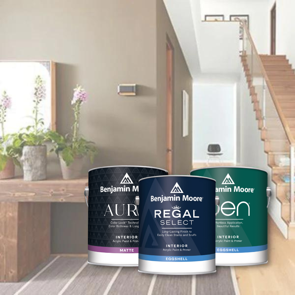















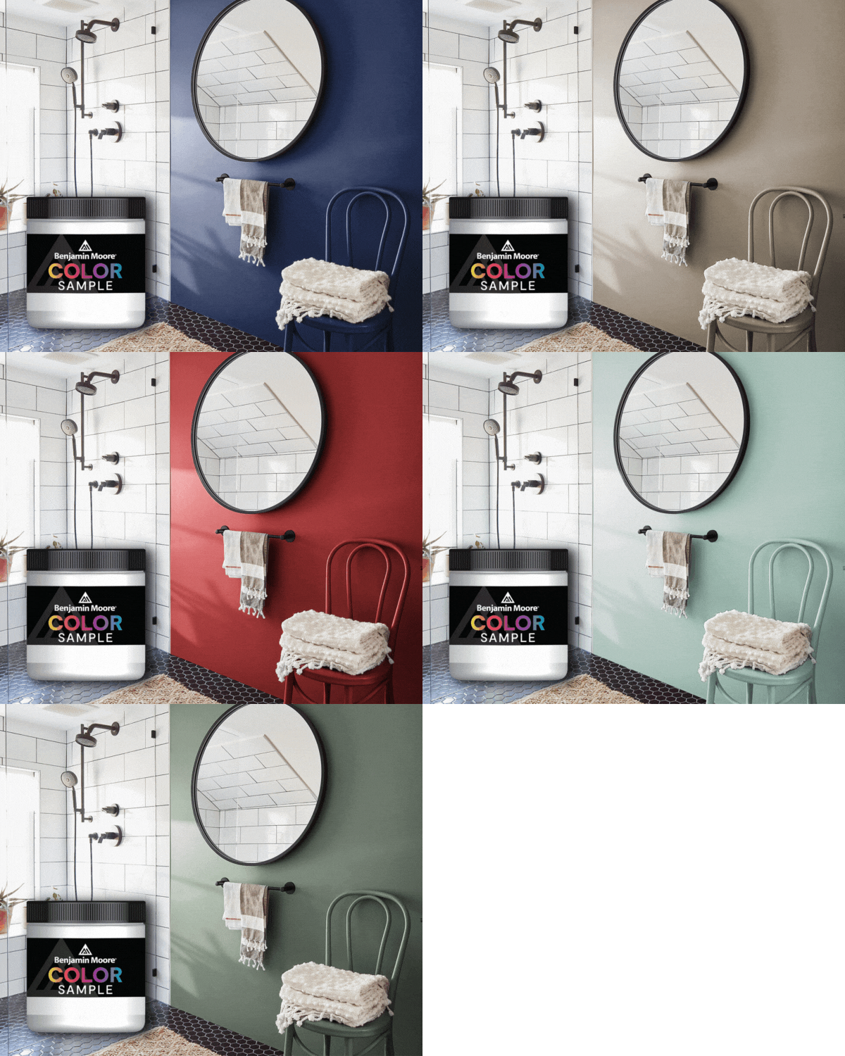


Fall is the perfect time to freshen up the paint in your Chicago home. Choosing supplies and finishes is easy, but selecting colors can be complex, to say the least. So, what do you do? You let our team at JC Licht share our paint color expertise, of course!
Setting the Mood with Color
Before you bring home that first paint sample, consider the ambiance you desire in the space you’re painting. Choosing color with intention helps ensure the room has the vibe you want. Do you want the soft, relaxing mood of greens or blues or the upbeat, energetic tone set by shades of red and orange? Consider your home’s lighting and how colors will dry when selecting shades.
Use Bold Colors Wisely
Benjamin Moore Eggplant 1379 will take your breath away as an accent color. As a primary color, it may make a space feel too dark and uninviting. We don’t want you to be intimidated by color, however. A home without color is like a black-and-white TV show; it’s enjoyable but could undoubtedly be enhanced. If you are unsure with out to utilize color, a good rule of thumb is to stick with neutral hues on two or three walls and reserve pops of color for accent walls and trim. Don’t forget that ceilings and interior doors are excellent spots to add color.

Create a Palette for Your Whole House
Great interior design is cohesive and flows easily between spaces. Creating a color palette for your home helps you to achieve this. Many modern homeowners are looking for a main neutral shade, like a greige tone, to carry throughout their entire home around which to build a palette of accent colors. Our pro tip? Make sure that your neutrals balance and pair well with your hard finishes and fixed elements like your counters, tile, or flooring options. Then, you can add pops of color with accent walls, artwork, or your beloved furnishings like area rugs, sectional sofas, or other décor.

Play Up Architectural Features
Make wainscotting in your home stand out by painting it a shade that contrasts with the remaining portion of the wall. Archways and built-ins are other fantastic places to highlight the power of paint. If you have a particularly impactful color you love, it will look perfect on molding or a mantel.
Sample at a Slow Pace
You may be chomping at the bit to get your paint project underway, but we can’t stress the importance of swatching samples enough. Choose a couple of colors you’re considering, and paint a sizable swatch of each on the wall of a room. Then, let it linger for a few days to get an authentic feel for how it will look over the long term. It’s essential to view dried colors at various times of day, as the appearance of paint can change between sunrise and evening hours.
Guide to Interior Painting in Chicago
Bring your home’s interior to life with Benjamin Moore paint colors from JC Licht. We are Chicago’s premier destination for Benjamin Moore paint, Hunter Douglas window treatments, and upscale wallpaper.
Visit one of our showrooms across the Midwest or schedule an in-home consultation today. You can count on JC Licht to Make it Happen! JC Licht is the preferred provider of Hunter Douglas products for the Midwest and Chicagoland. Contact us today!


