


A degree in interior design isn't required to assemble an incredible color palette, but a basic understanding of color theory is helpful. Color theory is the science of determining what colors look good together and how to combine them best. Colors affect the ambiance of a space, our mood, and even physiological factors like appetite, so it's imperative to choose yours wisely.
Why Do Window Treatments Matter So Much?
Natural light looks great in any space. If you keep up with real estate, you likely have seen listings indicating the number of windows and amount of natural light a home has because it's a significant selling point.
Windows are an automatic focal point in any space, and people will look at them whether you want them to or not. Since windows are such an integral feature in an area, it only makes sense to give your window treatments ample consideration.
The Quick & Dirty of Color Psychology
Now that you know the significance colors have on the overall aesthetic of a space, you're probably wondering what specific shades are known for. We know your time is precious, so we put together a "Cliff Notes-esque" explanation:
- Black - Sophistication, mystery
- Gray - Maturity, stability
- White - Simplicity, purity
- Red - Passion, excitement
- Pink - Love, beauty
- Yellow - Joy, energy
- Purple - Luxury, wisdom
- Blue - Tranquility, confidence
- Green - Restorative, relaxation
Start Scheming
The most popular color schemes are monochromatic, analogous, and complementary, so we'll stick with those today. Don't let decision paralysis get the best of you when choosing colors for a space. Pick a color, any color, and get to work.
There's a way to make any color you love work in every space; trust us. Let's not forget that black or white can be added to any other wheel member, making every color easier to work with.

Working with White
We encourage you to be creative and decisive when designing your window treatments. White is a popular hue because it can make spaces look more expansive. Many people love white curtains but don't want the room's aesthetic to be generic and sterile.
The logical solution is to introduce color, but which ones? If you're going for a smooth, sophisticated vibe, use varying shades of gray in the rest of the room. White drapes with sheer charcoal panels against dove-gray walls with steel-colored accents create a classic style that will stay in style for years to come.
When the Grass is Greener
We know that white curtains aren't for everyone. Does your ideal space include green curtains, but you're unsure how to incorporate them? We will assume that if you want green on a primary focal point, you're a fan of color in general. An analogous color scheme is our recommendation for a visually interesting but also refreshing and stimulating space.
Pair green curtains with selections from the neighboring blue-green hues for a tranquil, relaxing atmosphere. Do you have something more exciting in mind? Pull accents from the yellow-green section of the color wheel for an aesthetic that embraces health and abundance, like the newly grown grass in spring.
Put Color Theory to Work in Your Chicago Home
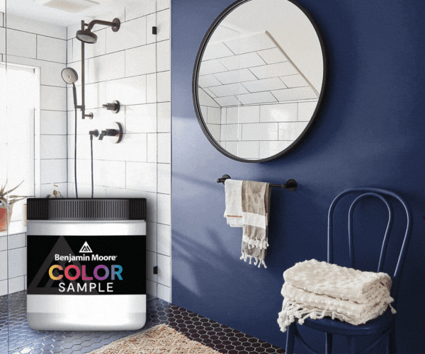
JC Licht can help you navigate the waters of color theory to design window treatments that dazzle. We are Chicago's premier destination for Hunter Douglas window treatments, Benjamin Moore paint, and premium wallpaper. Visit one of our many locations or schedule an in-home consultation. You can count on JC Licht to Make it Happen! JC Licht is the preferred provider of Hunter Douglas products for the Midwest and Chicagoland. Contact us today!


