


"Reminiscent of summer vacations by the sea, this soft yellow-green feels calm and breezy" — BenjaminMoore.com
There's something timeless about a color that instantly makes a room feel calm, welcoming, and effortlessly fresh. Benjamin Moore Nantucket Breeze 521 is one of those shades. Inspired by coastal living and breezy seaside escapes, this soft yellow-green creates a relaxed atmosphere that feels equally at home in traditional, transitional, and modern interiors. Benjamin Moore describes it as "calm and breezy," making it an ideal choice for homeowners looking to bring lightness and serenity into their spaces.
Whether you're refreshing a bedroom, brightening a bathroom, or creating a peaceful kitchen palette, Nantucket Breeze offers a subtle hint of color while still acting like a sophisticated neutral.
Key Takeaways
- Benjamin Moore Nantucket Breeze 521 is a soft yellow-green with warm coastal undertones
- With an LRV of approximately 65.45, it reflects a generous amount of light and helps spaces feel open and airy
- This shade works beautifully in bedrooms, bathrooms, kitchens, and relaxed living spaces
- Nantucket Breeze pairs well with warm whites, sandy neutrals, muted blues, and natural wood tones
- The color adapts throughout the day, appearing warmer in sunlight and softer in low light
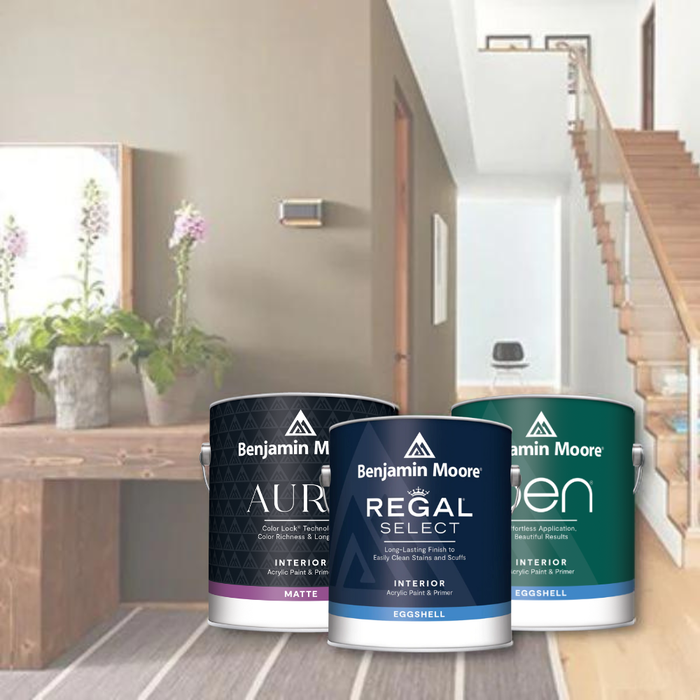
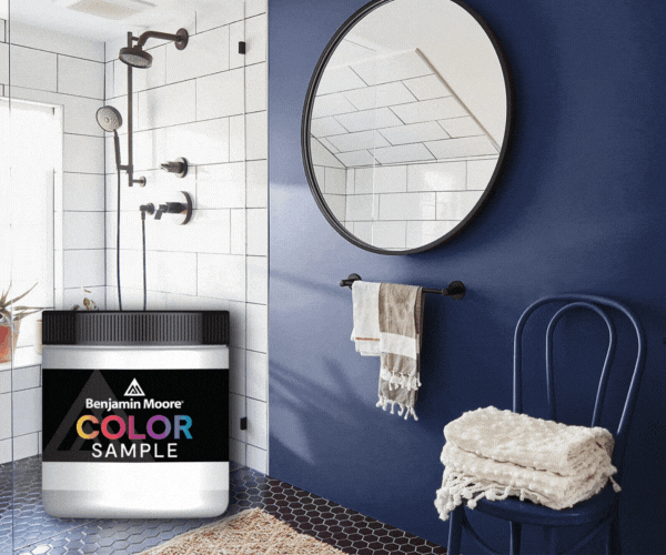
- You can explore this color in person at your local JC Licht store or order peel-and-stick paint samples for testing at home
Our Designer's Take
Daytrips to Martha's Vineyard, sailing at sunset, clean towels warmed by the sun and salty air, bonfires on the beach, fresh crabs and crawfish plucked directly from the sea. Step into the relaxing coastal oasis of Nantucket Breeze 521 . Kick off your sandals, pour a fresh lemonade and truly relax into this serene, lived-in hue. Take your time as waves of soft, gentle yellow and a light, earthy green settle in around you to create an atmosphere of both comforting heritage and the excitement of building new traditions with each fresh season.
— Brooke Doyle, Design Consultant
What is Benjamin Moore Nantucket Breeze 521?
Benjamin Moore Nantucket Breeze 521 is part of the Benjamin Moore Classics® collection and captures the feeling of a coastal retreat without leaning overly beach-themed.
At first glance, the color reads as a light green softened with creamy yellow and muted gray undertones. The result is a highly versatile paint color that feels organic, relaxed, and sophisticated rather than bright or overpowering.
Unlike trendy greens that can sometimes feel too saturated or bold, Nantucket Breeze has a quiet softness that allows it to work almost like a neutral. It adds color to a room while still maintaining a timeless quality that homeowners tend to love for years.
This shade feels especially fitting for homes that embrace:
- Coastal-inspired interiors
- Cottage and farmhouse styles
- Transitional design
- Vintage or heritage-inspired spaces
- Organic modern aesthetics
What is the Benjamin Moore Classics Paint Collection?
"Legacy colors that stand the test of time, these foundational, Benjamin Moore classic colors offer steadfast, tried-and-true hues for your home, and its wide range of options ensures lasting style for every room. The collection embodies an edited, refined collection of Benjamin Moore paint colors that exude effortless elegance." — Benjamin Moore

Color Characteristics of Nantucket Breeze 521
One of the reasons homeowners gravitate toward Nantucket Breeze is its balance. It sits comfortably between green, cream, and warm neutral tones.
The color has:
- A soft yellow-green base
- Muted gray influence that keeps it sophisticated
- A gentle warmth that prevents it from feeling cold
- An airy quality that brightens interiors
Because the color is subdued rather than vivid, it works exceptionally well across large wall expanses without overwhelming a room.
LRV of Nantucket Breeze 521
Light Reflectance Value, commonly called LRV, measures how much light a paint color reflects. Benjamin Moore Nantucket Breeze 521 has an LRV of approximately 65.45, placing it firmly in the light paint category.
That means:
- It reflects a substantial amount of natural and artificial light
- Rooms feel brighter and more open
- Smaller spaces can appear larger
- The color maintains softness without washing out completely
This lighter LRV makes Nantucket Breeze especially useful in:
- Bathrooms with limited natural light
- Narrow hallways
- Guest bedrooms
- Kitchens
- North-facing rooms that need warmth
Undertones of Nantucket Breeze 521
Undertones are what give a paint color its personality, and Nantucket Breeze has several subtle layers working together.
Its undertones include:
- Warm yellow
- Soft gray
- Muted sage green
The yellow undertones bring warmth and comfort, while the gray softens the green and prevents it from feeling too pastel or too earthy. These undertones help the color adapt beautifully depending on lighting conditions and surrounding décor. Natural textures like oak, linen, rattan, brass, and stone tend to enhance its coastal elegance.

Lighting Considerations for Nantucket Breeze
Bright Rooms
In spaces flooded with natural sunlight, Nantucket Breeze appears lighter and more cheerful. The yellow-green tones become more visible, creating a fresh and airy coastal look. South-facing rooms especially bring out the warmth in the color, making the space feel inviting and sunny throughout the day.
Low-Light Rooms
In dimmer spaces, the muted gray undertones become more noticeable. The color softens into a gentle neutral green that feels cozy and serene rather than dark. This makes it an excellent option for bedrooms, powder rooms, and reading nooks where a calming atmosphere is important.
North-Facing Rooms
North-facing rooms often pull cool tones from paint colors. Fortunately, Nantucket Breeze retains enough warmth to avoid feeling icy or sterile. The color still feels soft and comfortable while maintaining its green character.
East- and West-Facing Rooms
East-facing light brings out the fresh green qualities during the morning, while west-facing light enhances the warmer yellow undertones later in the day. This subtle shift throughout the day gives the color depth and movement without becoming dramatically different.
Best Rooms to Use Nantucket Breeze 521
One of the greatest strengths of Benjamin Moore Nantucket Breeze 521 is its flexibility across different spaces.
Bedrooms
Nantucket Breeze creates a peaceful retreat-like atmosphere in bedrooms. Pair it with crisp white bedding, natural woods, and soft linen textures for a calming environment.
Bathrooms
Its airy coastal quality feels especially beautiful in bathrooms. White tile, brushed brass fixtures, and warm marble pair naturally with this color.
Kitchens
For kitchens, Nantucket Breeze works beautifully on:
- Walls
- Cabinets
- Kitchen islands
- Pantry doors
Pair it with creamy whites and warm wood accents for a timeless look.
Living Rooms
In living spaces, Nantucket Breeze acts as a subtle backdrop that complements both modern and vintage furnishings. Its understated color allows artwork, textiles, and layered décor to shine.
Color Pairings with Nantucket Breeze 521

Newt Green 2149-10
Benjamin Moore Nantucket Breeze 521 paired with Newt Green 2149-10 creates a rich, nature-inspired palette full of depth and character. Nantucket Breeze brings a soft, breezy yellow-green quality, while Newt Green introduces a much deeper olive tone with acidic notes of yellow and green and a dramatic LRV around 19.6.
Together, the pairing feels organic, earthy, and sophisticated — almost like a lush botanical garden layered with sun-washed greenery. Nantucket Breeze keeps the palette airy and relaxed, while Newt Green grounds the space with moody contrast and an upscale designer feel.
This combination works beautifully for:
- Accent cabinetry or kitchen islands
- Moody powder rooms
- Libraries and offices
- Built-ins and millwork
- Front doors or furniture accents
Natural woods, aged brass, woven textures, and warm creams help soften the contrast and enhance the palette's elevated organic feel. The result is dramatic without feeling harsh or overly modern.

Freedom Trail 277
Pairing Nantucket Breeze 521 with Freedom Trail 277 creates a warm, cheerful palette inspired by sunlit coastal homes and classic heritage interiors. Freedom Trail is a deep and mellow golden yellow with a sophisticated warmth and an LRV around 58–59.
Where Nantucket Breeze leans soft green, Freedom Trail introduces a rich golden warmth that enhances the yellow undertones already present within Nantucket Breeze. The combination feels welcoming, timeless, and comfortably lived-in without becoming overly bright.
This pairing is especially beautiful in:
- Kitchens and breakfast rooms
- Mudrooms
- Cottage-style interiors
- Historic homes
- Family rooms with natural light
The palette evokes vintage charm while still feeling fresh and current. Layering in warm whites, linen fabrics, oak finishes, and antique brass accents can make the space feel especially cozy and inviting.
Why Homeowners Love Nantucket Breeze
Paint trends come and go, but colors that feel comforting and livable tend to stand the test of time. Homeowners love Benjamin Moore Nantucket Breeze 521 because it:
- Feels fresh without being trendy
- Adds color without overwhelming a room
- Works in many different design styles
- Brightens interiors naturally
- Creates a calming atmosphere
It's the kind of shade that quietly transforms a space and makes a home feel more peaceful the moment you walk in.
Get a Sample from JC Licht
The best way to experience Benjamin Moore Nantucket Breeze 521 is to see it in your own home and lighting conditions.
Visit your local JC Licht store to explore Benjamin Moore colors in person, speak with our paint experts, and pick up a sample. You can also browse and order peel-and-stick paint samples online to see how Nantucket Breeze changes throughout the day in your space.


