


“There, between the attic floorboards, a small, pink sweetheart necklace called out to be found.”
— Benjamin Moore
With a fresh Spring season upon us, we’re happy to report that Millennial Pink has matured and invited its warmer, more elegant and content cousin to stay. We adore Benjamin Moore’s “Lost Locket” CSP-410 for its hints of hushed secrets between best friends, private crushes clutched closely to the heart, dreamy nostalgia of fading childhoods, and brushes with Victorian intimacy. Dare we compare the hue to the recent boudoir design for Wuthering Heights’ doomed heroine Catherine Earnshaw in the tragically romantic story’s 2026 film adaptation? A dustier rose than Suzie Davies brilliant set design, Lost Locket still conveys the timeless, ageless yearning of the human heart. Read on to learn more about our Color of the Month, its story, and how to use it in your own home.
Key Takeaways
- Lost Locket is a warm, soft neutral with subtle undertones
- A statement color that won’t overpower, it works beautifully in both modern and traditional spaces
- Shifts slightly depending on lighting—appearing warmer in natural light and more muted in low light
- Pairs well with earthy greens, rich neutrals, and soft gold-inspired tones
- A versatile choice for living rooms, bedrooms, and open-concept spaces
What is "Lost Locket"?
Lost Locket (CSP-410) by Benjamin Moore is a warm, understated neutral that sits between mauve and dusty rose. It’s part of the premium Color Stories Collection, known for its complex pigments and rich depth. Unlike flat neutrals, Lost Locket shifts subtly throughout the day, offering a layered, designer-quality look that feels both timeless and current.
Lost Locket acts as a "bridge color", gently balancing the line between pink and neutral, warmth and softness, and modern trend with timeless appeal.
That’s exactly why it’s relevant right now:
It gives you ambiance without committing to bold color, which is where design is
heading. As an answer to stark minimalism, interiors are shifting away from cold grays to warmer, livable neutrals. Lost Locket acts like a warm neutral with a hint of color. Blush, Clay, Mushroom, Mauve are all neutrals with personality, and Lost Locket sits right in that category.
Cozy, Calming, and Layered with lived-in accents to tell the story of your life. Lost Locket creates a gentle, comforting atmosphere rather than a cold, sterile one.
Designers love Lost Locket because it:
- Pairs with whites, creams, woods, and deeper earth tones
- Works in modern, traditional, and transitional spaces
- Acts as a backdrop for texture (linen, boucle, wood grain)

Lost Locket is incredibly versatile and works well across a variety of spaces:
Bedrooms: soft, calming, and cozy
Living Rooms: adds warmth without going beige
Entryways: creates a subtle first impression
Powder Rooms:elevated and boutique-inspired
Color Characteristics
LRV (Light Reflectance Value): 40.9
This mid-range LRV means Lost Locket reflects a moderate amount of light:
- Richer than light neutrals, but not too dark
- Balanced—won’t feel washed out or heavy
- Suitable for a wide range of rooms and lighting conditions
How Lost Locket Looks in Different Rooms and Lighting
Lost Locket sits in that “soft mid-tone” zone that works well across entire rooms. It has enough depth to add warmth and dimension, yet avoids looking washed out in bright light. Nuanced in undertones, but still light enough to keep spaces feeling open and airy. Expect the color to shift depending on lighting—sometimes reading more beige, sometimes more pink.
Bright Rooms
In South facing spaces or with lots of natural light, Lost Locket:
- Appears warmer
- Feels inviting and sunlit
- Works beautifully in south- and west-facing rooms
Low Light
In North facing or darker spaces, the color:
- It may read a bit deeper and moodier, showing more of its undertones.
- Feels cozy and grounded rather than bright
Undertones
- Primary hue: Red / pink family
- Secondary undertones:
- Warm beige / taupe
- Slight gray (greige influence)
This combination is what makes it feel softened and sophisticated, but not overly feminine or pastel. Lost Locket is extremely versatile with other finishes (woods, brass, whites).
Design Takeaway
Lost Locket is a modern neutral that offers just enough color to feel intentional, while remaining easy to live with. It’s warm, adaptable, and ideal for creating spaces that feel both current and timeless.

Color Pairings with "Lost Locket"
Lost Locket certainly does not need to be the loudest presence in a room - it is bursting with its own girlish secrets and the knowledge of generations past, but never, ever boastful. This quiet confidence allows other colors to shine. Is your home historic or Victorian? All the better! Try modernizing this vintage beauty by pairing with creamy butter yellows or goldenrods (try Golden Hills 262) and vibrant emeralds, jungle greens, and teals (like Dragonfly AF-510). We suggest using Lost Locket as a subtle, romantic wall color, then really give them something to gossip about by adding vibrant and unexpected wallpaper (yes, even on the ceiling!), textured pillows, rugs, and textiles full of your own personality, your story, to keep things interesting. . . and to keep your guests guessing!
Lost Locket shines as a supporting player, allowing other design elements to stand out while still adding warmth to the space.

Golden Hills 262: A rich, golden-toned neutral that enhances warmth.
Perfect for: accent walls, dining rooms, layered palettes

Dragonfly AF-510: A deep, earthy green that adds contrast and depth.
Perfect for: cabinetry, furniture, or statement accents
Pattern & Texture
Pair with warm woods, linen, boucle, and brass finishes to create a layered, inviting look. For a more dramatic approach, consider incorporating bold wallpaper or textured textiles
Savuti Wallpaper from Cole & Sons
For a bold yet sophisticated pairing, Savuti wallpaper introduces:
- Organic patterns
- Earthy tones
- A designer-level finish
This combination works especially well in powder rooms, dining rooms, or on feature walls.

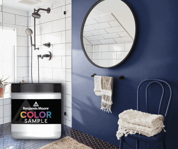
Sampling, Ordering, and Important Considerations
Screen colors vary significantly from actual paint colors. What you see on your phone, tablet, or computer monitor will not perfectly represent Lost Locket CSP-410 in your home. This is why sampling matters.
Before painting entire rooms:
-
Order a Benjamin Moore 8-oz sample pot from JC Licht to see the color in physical form
-
Apply the sample to a sample board. Be sure to do two coats
-
Observe the color at different times of day—morning, afternoon, and evening light all affect perception
Pro Tip: Leave an edge of white on your sample board or place your board on a white backdrop. This helps to isolate the paint sample from existing colors in the space, which will allow for better color perception.
For contractor paint needs or larger projects spanning more than one room, JC Licht staff can help calculate coverage requirements and ensure color consistency across multiple gallons.

Schedule a Color Consultation with JC Licht
Choosing the perfect paint color can be challenging, but our consultants at JC Licht are here to help. Schedule a personalized color consultation to explore Benjamin Moore Lost Locket CSP-410 and complementary shades tailored to your space and style.
Whether you're refreshing a single room or tackling a whole home, our knowledgeable consultants provide guidance on color selection, finishes, and paint products to ensure a flawless interior paint job. Visit https://jclicht.com/pages/color-at-home or call (844) 525-7603 to begin.


