Go Big and Bold
One of the biggest trends we’re predicting for 2018 is a resurgence of the early 90s bright, vibrant and bold jewel-toned colors. We’re talking curtains with plenty of oomph: bright magentas, aquas, and turquoises that pop, and high contrast combinations of pink and blue.These brighter colors look fantastic when used correctly, but it is absolutely possible to overdo them. Be cautious of how much contrast you use and where. Curtains with a vibrant pink and blue accent strip against white or black, for example, will look better than bright pink curtains paired with bright turquoise walls. It’s all about achieving the right balance.
Shiny, Space-Age Surfaces
Yet another throwback to the 90s is the shiny surface (mostly made from mirror and metal) which is making a comeback. These surfaces include everything from stylized mirrors that hang on walls to small accent pieces such as cupboard knobs and even metal end tables.Like jewel tones and brights, it’s more than possible to create a garish mess if you put in too much shine. The result becomes more like a heavily sequined suit rather than about the luxury and new-age feel it’s meant to impart.
For walls, skip the shiny wallpaper and use a wallpaper with an ever-so-slight textured sheen instead. Or, stick with a basic dark or light paint job (black and white work remarkably well, here) and hang a stylized silver mirror above a side table. Metal accent walls and backsplashes have quickly been gaining popularity lately.
For window treatments, it’s best to avoid any sort of shiny fabric and use shine in your curtain rods and hardware elements. That said, muted masculine colors such as maroon, charcoal, and navy blue look fantastic when made from silk and satin. Avoid outright shine, plastic, and anything kitsch.
Shapes Galore
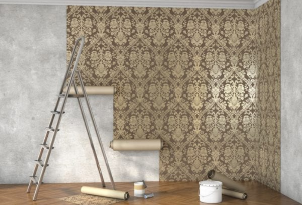
In wall treatments, we are also witnessing a shift back to geometric patterns. Unlike the other two trends, this trend hails from the late 1960s and early 1970s, but this style isn’t quite the same as it was several decades ago; gone are the big, garish circles and strange brown colors. Instead, this year is bringing in gorgeous muted creams with lacy scrollwork, fleur-de-lis, diamonds, and digitized versions of everyday shapes like diamonds.Want to bring this look in? Pair it with crown molding and more traditional wood floors for best results. Geometric wallpaper also works well as an accent or backsplash. What doesn’t work is using multiple patterns within the same room—it’s just too busy for the average eye.
Minimalism for Busy Lives

Last, but certainly not least, is a continuation of minimalism and muted jewel tones. This is the perfect look to chase if you just don’t have the time to install or maintain complicated interior decor themes.
A bit of charcoal paint on the walls, soft suede furnishings, white throws, and simple, understated fixtures create a space that’s airy, light, and focused on relaxation. Worried about your space feeling too “cold” or sterile? Warm it up with a set of wooden Hunter Douglas window treatments!
A bit of charcoal paint on the walls, soft suede furnishings, white throws, and simple, understated fixtures create a space that’s airy, light, and focused on relaxation. Worried about your space feeling too “cold” or sterile? Warm it up with a set of wooden Hunter Douglas window treatments!


