


You’ve likely heard of the psychology of color, but you may not know exactly how powerful a tool it is, both in and out of your home. Color theory is implemented all around us every day. From the advertisements we see to the places we visit, intentional color choice impacts almost everything we do. You can even use the psychology of color to design your ideal home!
Psychology of Color 101
Color psychology was first developed in the early 20th century by Swiss psychiatrist Carl Jung. He used the method during therapy sessions to help his patients express themselves. Because different colors can reflect and influence your mood in a multitude of ways, color can be a helpful tool in expressing or changing an individual’s attitude or outlook.
Today, the psychology of color is often used in marketing, advertising, and design. Companies carefully select their brand colors, taking into account the emotional attributes of each shade. In interior design, hues are selected based on the general purpose of each space. Using the color chart, designers are able to establish which colors will complement the ideal mood of each room.
Color Psychology Chart
The backbone of the psychology of color, the color psychology chart explains the moods attributed to each of the main colors. There is some variance depending on shade, but for the most part the colors are:
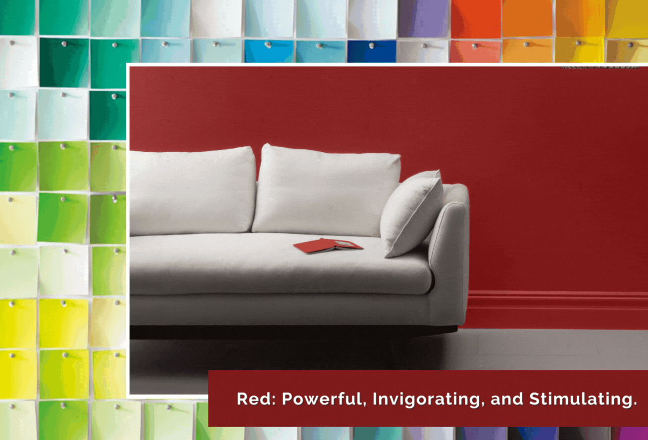
- Red: Powerful, invigorating, and stimulating. This color is perfect for executive offices. It is often used as an accent color because of its bold hue.
- Yellow: Cheerful, happy, and optimistic. Yellow is a wonderful residential color, but using a too-dark shade could have adverse effects, like irritability.
- Blue: Calm and soothing. Studies have shown that blue is optimal for promoting focus and studying. It’s perfect for a home office!
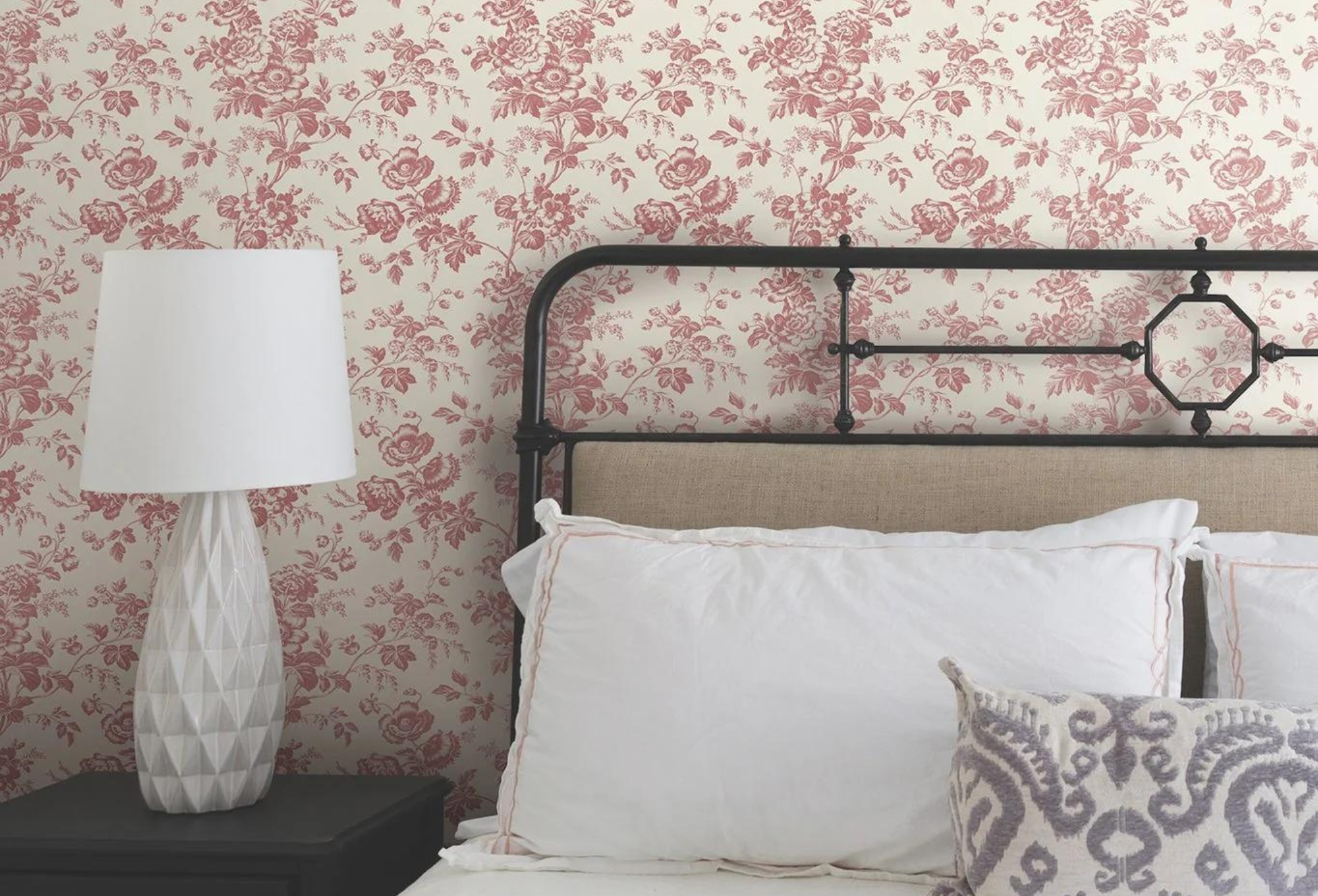
- Green: Fresh, rejuvenating, and serene. Green shades are reminiscent of nature and are the perfect choice for living rooms and bedrooms.
- Orange: Energetic, creative, and free. Use orange in kids playrooms and bathrooms to ignite a positive spark!
It is important to understand that the psychology of color is not solely based on science. To achieve the full effect, consider your natural preferences and allow your instinct to guide you through your color selection.
Psychology of Color in Design
When incorporating color psychology into your home, try to balance science with personal preference to discover your perfect color palette. You can do this by prioritizing your individual style over the supposed function of a space. Blue may be the recommended color for a home office, but nothing’s stopping you from creating a pink paradise or keeping it classy with black and gray shades.
Design Help at JC Licht
Our design experts are eager to help you refresh your home or office using the psychology of color! We are ready to assist you with your commercial and home improvement needs, including Benjamin Moore paints, Hunter Douglas window treatments, hardware, and more. Book your in-home consultation today!
No matter the project, you can count on JC Licht to Make it Happen! JC Licht is the preferred provider of Hunter Douglas window treatments for the Midwest and Chicagoland. Contact us today!